Delve into the fascinating statistics from the 2023 5K@EASD virtual run. This analysis serves as a testament to the power of Tableau, a tool that allows us to visualize and understand data in a matter of minutes.
You can explore the full analysis in our 5K@EASD Story Points on Tableau Public.
Story Points Breakdown
- Welcome: An introduction to the analysis.
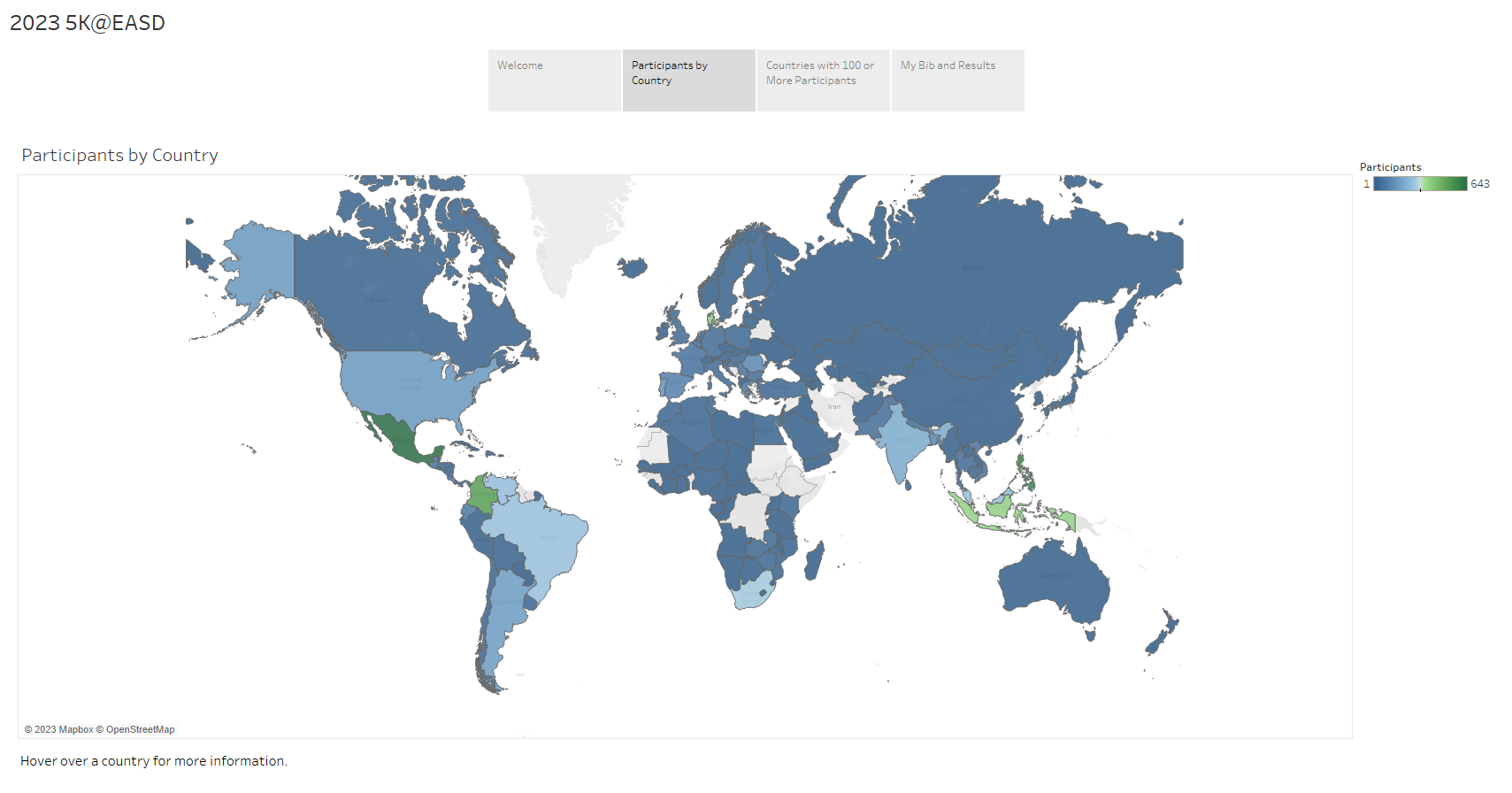
- Participants by Country: A vibrant, color-coded map that displays the number of participants from each country.
- Countries with 100 or More Participants: Interactive bar charts that show the number of participants by country and gender. You can select any combination of country and gender to see how the counts change.
- My Bib and Results: A personal touch to the analysis.
We hope this analysis provides you with a clear understanding of the 2023 5K@EASD virtual run's reach and impact. We also hope it demonstrates the potential of Tableau as a powerful tool for data visualization and analysis.