

Explore the visualization of 5K@ADA race results using Tableau. Learn how to create interactive maps and charts that showcase geographic distribution and performance metrics. Discover how calculated fields and interactivity features in Tableau make the data analysis both engaging and informative.
Key Points
- Introduction to 5K@ADA Race: Brief overview of the race and its significance in promoting diabetes awareness and research.
- Data Preparation: Steps involved in preparing the dataset, including the left join between ADA Race Data and Countries datasets.
- Creating Visualizations in Tableau: Explanation of the visualizations created to analyze the 5K@ADA race data.
Introduction
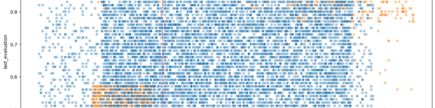
The 5K@ADA Virtual Challenge brings together people around the world and American Diabetes Association (ADA) annual conference attendees to emphasize the need for increased physical activity to help prevent diabetes and its complications. This awareness activity provides participants with the opportunity to raise public awareness about the importance of a healthy lifestyle in preventing and controlling diabetes. A previous blog post discussed the process of collecting race data through complex web scraping techniques using Python. This post demonstrates how to visualize the scraped data to uncover insights about the participants and their race performance.
Data Preparation
To begin visualizing the race data, the dataset needs to be prepared. The data sources used include:
- ADA Race Data for Visualization.csv
- Countries.csv
The ADA Race Data for Visualization is left joined with the Countries dataset on the Country Code. This step ensures that every country code in the race data has a country name to go with it.
Creating Visualizations in Tableau
Tableau is a powerful tool for creating interactive and insightful data visualizations. The key visualizations created to analyze the 5K@ADA race data are below.
Visualization 1: Map of Participants by Country
Objective:
- Show the geographic distribution of participants.
Features:
- Map visualization with slider controls for Enrollment and Age Group.
Steps:
- Setting up the map: The geographic data from the Countries.csv file is used to plot the participants on a world map.
- Adding slider controls: Slider controls for Enrollment and Age Group are added to allow dynamic filtering of the data.
- Customizing tooltips: Tooltips are customized to display the participant counts for each country, providing immediate insights into the distribution.
Visualization 2: Participants for Top 15 Countries
Objective:
- Highlight the top participating countries.
Features:
- Bar chart with a slider control for Age Group filtering.
- Context filter for Age Group to process before selecting the top 15 countries.
Steps:
- Creating the bar chart: A bar chart is designed to display the top 15 countries by the number of participants.
- Implementing the context filter: The Age Group context filter is added to ensure that it processes before the selection of the top 15 countries.
- Adding and configuring the slider control: A slider control is implemented to allow filtering by Age Group, enhancing the chart's interactivity.
Visualization 3: Times by Age Group
Objective:
- Compare race times across different age groups.
Features:
- Interactive chart with options to select time measures (minimum, average, maximum) and enrollment type.
- Dynamic chart title based on selected measure.
Steps:
- Designing the interactive chart: The chart is set up to display race times, with interactive elements allowing users to switch between different time measures.
- Creating parameters and calculated fields: Parameters and calculated fields are created to facilitate the selection of minimum, average, or maximum times.
- Configuring dynamic titles: The chart title is made dynamic using calculated fields to reflect the chosen time measure.
Visualization 4: Total Enrollment
Objective:
- Display total participant counts.
Features:
- Simple bar chart showing participant counts by enrollment type.
- Tooltip customization to show participant counts.
Steps:
- Building the bar chart: A straightforward bar chart is created to show the total number of participants by enrollment type.
- Customizing tooltips: Tooltips are enhanced to display participant counts, making the chart more informative.
Adding Interactivity and Calculated Fields
Interactivity for Times by Age Group:
- Calculated fields are used to display different time measures based on user selection.
- Slider controls and parameters are added to allow users to interactively choose the time measure and enrollment type.
Calculated Fields:
Calculated fields drive the visualizations:
- Measure to Show: Determines which time measure to display.
- Time Measure (Parameter): List of string values (Minimum Time, Average Time, Maximum Time).
- Time (Avg), Time (Max), Time (Min): Aggregate functions for the respective time measures.
- Participant(s): This field dynamically adjusts the label to reflect singular or plural based on the participant count. This ensures that tooltips displaying participant counts are grammatically correct for the count displayed. For example, 1 Participant instead of 1 Participants.
Publishing and Sharing the Visualizations
- Publishing to Tableau Public: The visualizations are published to Tableau Public, making them accessible to a wider audience. This platform allows users to interact with the visualizations directly.
- Sharing Options: The visualizations can be shared through direct links or embedded into websites and blogs. This enhances the accessibility and reach of the insights derived from the data.
- Interactive Features: The published visualizations retain all interactive elements, such as sliders and dynamic titles, allowing users to explore the data in depth.
Summary
Through these visualizations, key insights about the 5K@ADA race participants and their performance are uncovered. The geographic distribution, top participating countries, and age group comparisons provide a comprehensive overview of the event. Readers are encouraged to explore the visualizations and interact with the data to uncover their own insights.
For those interested in the technical details of the web scraping process, refer to the previous blog post on Complex Web Scraping with Python.
Additional Resources
Visualizations at Tableau Public
Frequently Asked Questions
What are the best practices for cleaning and normalizing the data before visualizing it?
Ensure consistency in data formats (e.g., dates, numbers). Handle missing values appropriately, either by filling them, using defaults, or excluding them. Remove duplicates and irrelevant data. Standardize categorical values (e.g., country names). Validate data accuracy by cross-referencing with reliable sources.
What are some common pitfalls to avoid when creating interactive visualizations in Tableau?
Avoid overloading the visualization with too many interactive elements, which can confuse users. Ensure filters and parameters are intuitive and clearly labeled. Test the performance of the visualizations with your intended audience to avoid slow load times. Keep the design simple and focused on key insights.
How can I share the visualizations with colleagues who do not have Tableau installed?
Publish the visualizations to Tableau Public or Tableau Server and share the link with colleagues. Export visualizations as PDFs, images, or PowerPoint files for easy sharing. You can also embed Tableau visualizations into websites or blogs using the embed code provided by Tableau.
What are the performance considerations when dealing with large datasets in Tableau?
Use data extracts instead of live connections to improve performance. Optimize extract filters to include only necessary data. Aggregate data to reduce granularity where possible. Use efficient calculations and avoid complex or nested calculations. Monitor and manage Tableau's caching and background task settings.
How can I export the visualizations to other formats, such as PDF or PowerPoint, for presentations and reports?
In Tableau, use the "File" menu to select "Export As Image" or "Export As PDF" to save visualizations in these formats. For PowerPoint, use the "Export" option to generate a PowerPoint file with static images of your dashboards. You can also copy individual visualizations and paste them directly into other applications.


