A new way to view CGM data that focuses on patterns, not perfection.
This post explores how visualizing continuous glucose monitor (CGM) data by hour—rather than by day—reveals deeper insights into when glucose levels shift. By replacing traditional Time in Range charts with dynamic, time-specific visualizations, this approach emphasizes understanding over judgment. It highlights patterns like post-meal spikes and overnight stability, making glucose data more actionable and emotionally neutral.
Key Points
- Hourly View Adds Context: Reveals when glucose levels go out of range, not just how often.
- Flexible Range Selection: Users can toggle between 70–180 mg/dL and 70–140 mg/dL thresholds.
- Reframed Visual Cues: Reversed green-blue color scale avoids framing results as good or bad.
- Actionable Patterns: Shows consistent overnight control and post-meal variability.
- Emphasis on Exploration: Focuses on patterns and possibilities, not compliance.
- Technical Approach: Uses Tableau calculated fields for hourly binning and dynamic formatting.
Introduction
Traditional Time in Range (TIR) charts often summarize glucose control as a single percentage per day, offering little insight into when glucose levels shift. This approach, while familiar, can obscure important patterns—such as whether fluctuations occur after meals or during sleep—and sometimes lead to unnecessary judgment about glycemic control.
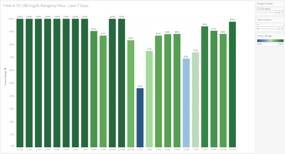
Instead of summarizing daily control as a single number, an hour-by-hour view reveals when glucose levels shift—bringing patterns like post-meal spikes or overnight stability into focus.
By pairing dynamic thresholds with time-specific detail and reframing visual cues, this approach moves from static reporting to interactive exploration. The result is a clearer, more actionable view of glucose data—one that emphasizes understanding, not perfection.
Rethinking Glucose Visualizations
The old Time in Range (TIR) (70–180 mg/dL) and Time in Tight Range (TITR) (70–140 mg/dL) daily charts gave a snapshot of control—but not much context. These visualizations didn’t show when highs or lows happened or whether patterns repeated over time. Both have now been replaced by a single, more flexible visualization.
What the Old Charts Missed
Both charts lacked time-specific detail. A day could look "in range," but without knowing whether spikes happened after meals or overnight, it's hard to make informed changes. And while TITR in particular raised concerns about being too judgmental, even the standard TIR chart failed to provide deeper insight.
A Shift in Thinking
This shift came after listening to Natalie Bellini, DNP, on the Diabetes Dialogue podcast she co-hosts with Diana Isaacs, PharmD. Natalie’s comments about toggling between ranges when she reviews CGM data with a patient sparked an idea: instead of focusing on compliance, focus on patterns and possibilities.
She said, “With diabetes, we don’t treat to what’s normal. We treat to what’s possible.” [paraphrased] That stuck with me.
“With diabetes, we don’t treat to what’s normal. We treat to what’s possible.”
Introducing: Time in Range by Hour
The new visualization breaks glucose data into hourly segments and lets users switch between the 70–180 mg/dL and 70–140 mg/dL ranges. This offers a much more granular view of what’s happening and when.
For example, instead of learning that glucose was out of range for 20% of the day, we can now see that:
- Glucose remained in range overnight and early morning
- Post-meal spikes occurred in the afternoon
- Levels returned to target range by evening
This pattern fits what I expected and is far more actionable than a single daily percentage.
A Better Use of Color
The new chart uses a reversed green-blue diverging color scale:
- Greener = more time in range
- Bluer = less time in range
This shifts the focus away from framing results as “bad” and toward highlighting areas for curiosity and possible improvement without judgment.
More Insight, Less Anxiety
Showing when glucose levels shift creates a more emotionally neutral way to review patterns by focusing on reflection, not perfection.
Why This Matters for Data Analysts
- Binning makes a difference. Hourly buckets reveal what daily averages conceal.
- Dynamic thresholds create flexibility. Users can compare different definitions of control without switching charts.
Visual framing matters. Reversing the color scale subtly reframes how people interpret performance—more “what’s working” than “what’s wrong.”
How the Hourly Bins Were Created
To enable hourly analysis, I used calculated fields in Tableau to group glucose readings by hour. The primary field, Time Bins 60, uses:
DATETIME(DATETRUNC('hour', [Date Time]))This formula rounds each reading down to the nearest hour, creating consistent hourly bins for clearer pattern detection.
Another field, Time NB 60, extracts the fractional part of the datetime:
FLOAT([Time Bins 60]) - INT([Time Bins 60])Since Tableau stores datetimes as floating-point numbers, this isolates the time of day as a decimal, which is then formatted using H AMPM (e.g., "9 AM", "10 PM"). These fields ensure that time-based trends are both accurate and easy to interpret.
Closing Thoughts
The right chart doesn’t just show the data—it shows what the data means. By shifting from daily summaries to hourly trends, and from rigid targets to flexible insights, this visualization brings both clarity and compassion to glucose analysis.
This update is part of a broader CGM data project built in Tableau, using hourly aggregation, calculated fields for range flexibility, and a reversed diverging color scale to subtly shift interpretation. It’s an example of how visualization choices—like binning intervals and color framing—can influence clarity and emotional tone.
Explore the visualizations:
Continuous Glucose Monitor (CGM) Visualizations
For more on the patient-centered side of this approach, see the companion article at:
https://jcst2d.com/index.php/articles/how-an-hour-by-hour-view-transforms-time-in-range-insights


