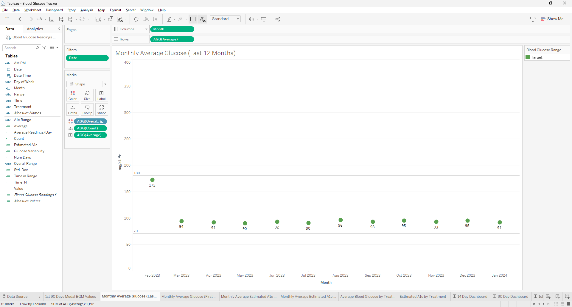
Creating a visualization for the most recent 12 months in Tableau can be a common requirement for time series analysis. To achieve this, you can use the `DATETRUNC` function to truncate your date data to the first day of each month, ensuring that your months will be in the correct order when aggregated. Here's how to use the `DATE(DATETRUNC('month',[Date]))` function effectively in Tableau for this purpose.
Understanding the DATETRUNC Function
The `DATETRUNC` function in Tableau truncates a given date to the specified date part, such as the year, quarter, or month. When you use `DATETRUNC('month', [Date])`, it will return the first day of the month for each date in your dataset. This is useful for creating consistent monthly data points for visualization purposes.
Steps
- Create a Calculated Field: In Tableau, create a new calculated field using the formula `DATE(DATETRUNC('month',[Date]))`. This will convert all dates in your dataset to the first of their respective months, without including the time along with the date. Only the date is necessary.
- Apply a Relative Date Filter: To focus on the most recent 12 months, apply a relative date filter to your worksheet. Add the date dimension to the filter and select 'relative date', then choose 'last twelve months'. This filter will automatically update as time progresses, ensuring that your visualization always represents the latest 12-month period.
- Use the Calculated Field in Your Visualization: Drag your new calculated field to the appropriate shelf (usually Columns) to use it as the axis for your visualization. This will ensure that your data is aggregated by the truncated month date, which will sort the months in chronological order.
- Adjust Aggregation as Needed: If you need to aggregate your data in a specific way (e.g., sum, average), make sure to adjust the aggregation settings for your measure values accordingly.
- Customize Your Visualization: You can now build your visualization as desired, whether it's a line chart, bar chart, or any other type that benefits from a monthly time series analysis.
Benefits of Using DATETRUNC
- Consistency: By truncating dates to the first of the month, you ensure that each month is represented consistently, which is crucial for accurate comparisons and trend analysis.
- Ordering: Truncated dates will naturally fall into chronological order, which is essential for time series visualizations.
- Flexibility: You can easily adjust the level of date truncation (e.g., to quarters or years) if you need to analyze your data at a different granularity.
Using the `DATE(DATETRUNC('month',[Date]))` function in Tableau is a powerful way to prepare your data for visualizations that require monthly aggregation. It ensures that your months are in order and that your visualization reflects the most recent 12-month period. This approach is part of Tableau's robust time series analysis capabilities, which allow for insightful trend spotting and variance analysis over time.
Frequently Asked Questions
Can this method be applied to other time units (like weeks or days) and if so, how would the approach change?
The DATETRUNC function can indeed be applied to other time units such as weeks or days. The approach remains similar, but the unit of truncation in the function needs to change (e.g., 'week' or 'day') to reflect the desired aggregation level.
How can you use the calculated field created with DATETRUNC in Tableau to compare year-over-year data?
To compare year-over-year data using DATETRUNC, you can create separate calculated fields for the current and previous years by manipulating the date part of your DATETRUNC calculation. Then, use these fields in your visualization to compare performance across different years.
What are the best practices for ensuring that the date formatting in the calculated field matches the rest of the dashboard elements in Tableau?
Best practices for consistent date formatting include setting the default date format in the data source, using calculated fields to standardize date formats, and applying consistent formatting settings across dashboard elements directly within Tableau's format options.