

A project’s real value comes from how well it adapts as the data changes.
Abstract
The 5K@ADA race results project has been updated for 2025 with improvements to data storage, cleaning, and visualization. Key enhancements include the use of SQLite for managing multi-year data, SQL-based deduplication, handling of multilingual gender values, and updated Tableau dashboards with year-based logic. These changes improve scalability, accuracy, and long-term usability.
Key Points
Read more: Adapting the 5K@ADA Race Results Project for 2025
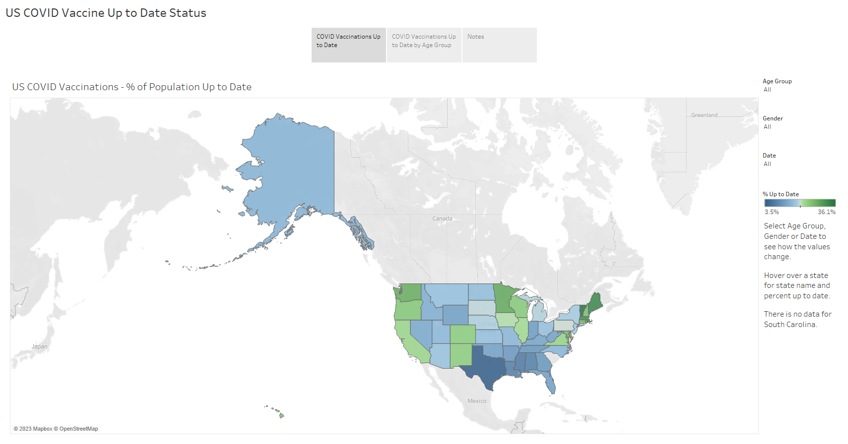
This project focuses on the utilization of a comprehensive dataset from the Centers for Disease Control and Prevention (CDC) to create interactive, color-coded visualizations that show the status of COVID-19 vaccinations across the United States. The dataset, although no longer updated, is a valuable resource for honing data cleaning skills in Python and developing interactive visualizations in Tableau.
The dataset, accessible to the public without restrictions, is a mix of aggregate, non-aggregate, and overlapping data. To ensure the accuracy and reliability of the analysis and visualization, a meticulous review and cleaning of the data are required.
Data Cleaning in Python
The data cleaning process in Python involves several steps:
Visualization in Tableau
The cleaned data is used to create two interactive visualizations in Tableau:
Link to visualization on Tableau Public
Data Source
Centers for Disease Control and Prevention (CDC) Public Data
COVID-19 Vaccines Up to Date Status
https://data.cdc.gov/Vaccinations/COVID-19-Vaccines-Up-to-Date-Status/9b5z-wnve/data
Published by: Centers for Disease Control and Prevention (CDC)
Public Access Level: Data asset is publicly available to all without restrictions (public)
License: Public Domain U.S. Government
The analysis of customer churn is a critical task that can significantly impact a bank's profitability and long-term success. Churn, the rate at which customers leave a bank, can be influenced by factors such as customer service quality, product offerings, and competitive dynamics within the industry.
The dataset includes a range of variables such as customer demographics, account details, and transaction history, which are necessary for understanding the patterns of customer churn.
The project involved a multi-stage process, beginning with data exploration and cleaning using Python. Python is a powerful tool for data manipulation, allowing for efficient identification and resolution of data quality issues. This step is crucial before any further analysis to ensure the integrity of the dataset.
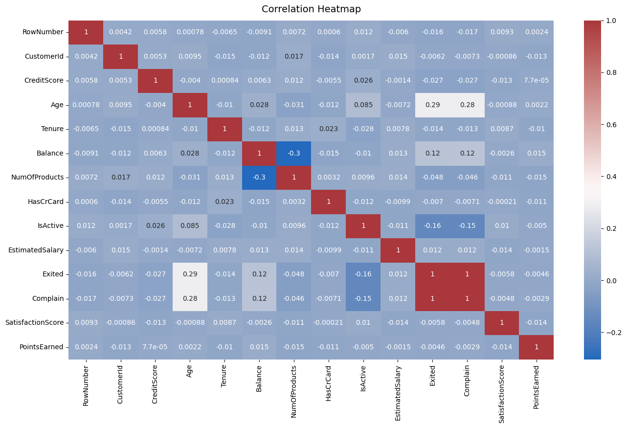
Once the data was prepared, I did a basic statistical analysis to look for anything interesting or unusual. Generating a correlation heatmap led to an important discovery: a perfect correlation (correlation of 1) between customers who complained and those who exited the bank, a finding that suggests customer complaints are a strong predictor of churn. Addressing customer grievances could be a key strategy in reducing churn rates.
Further exploration and visualization were carried out in Tableau to complement the analysis in Python. Tableau is a powerful visualization tool that can help in presenting data in an intuitive and impactful manner. The insights gained from the Python analysis, particularly the strong correlation between complaints and churn guided the creation of visualizations with Tableau.
The combination of Python for data preparation and statistical analysis, followed by Tableau for visualization, is a robust approach to understanding and addressing customer churn in banking. By utilizing these tools, banks can gain a deeper understanding of what causes customer churn and develop strategies to improve customer retention.
This bank churn analysis project underscores the importance of a thorough and methodical approach to data analysis in any project. Utilizing the strengths of both Python and Tableau provided actionable insights to reduce customer churn and improve the bank's competitive edge.
Bank Churn Analysis from https://www.kaggle.com/datasets/mathchi/churn-for-bank-customers (License - CC0: Public Domain)
Link to project files on GitHub
Link to visualizations on Tableau Public
Correlation heatmap from the data analysis in Python that revealed the strong relationship between customers who complained and those who exited the bank (variables 'Exited' and 'Complain'):
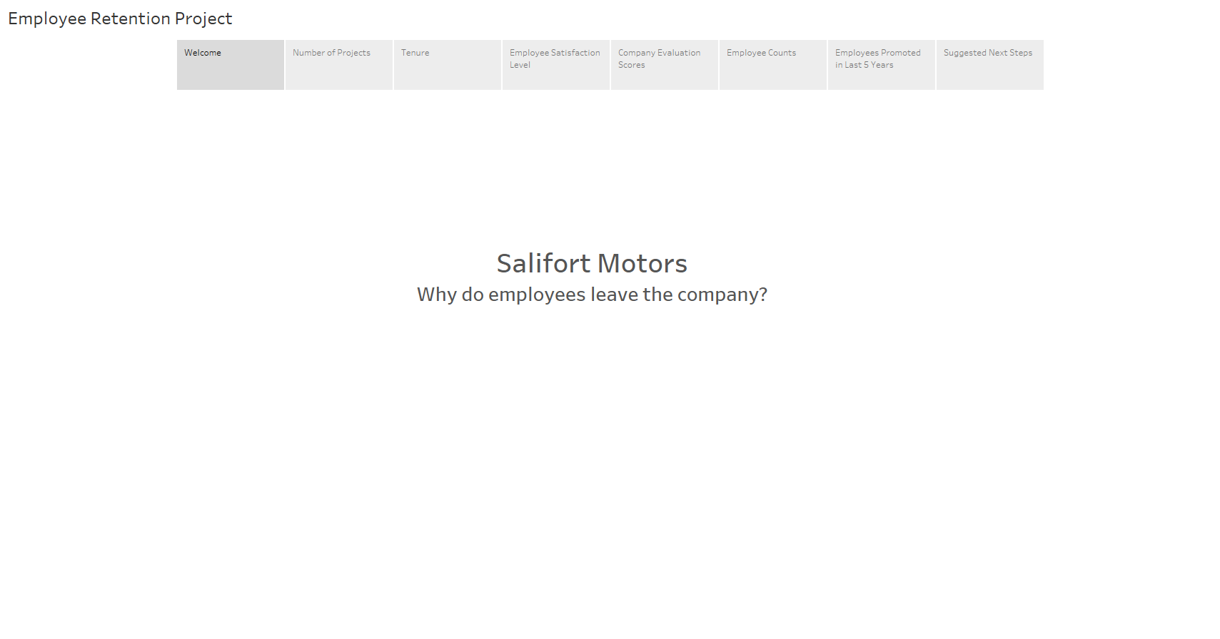
This project presents an interactive data visualization, designed to communicate key insights from our employee retention study at Salifort Motors. The presentation, accessible via Tableau Public, is intended for the company's executives and senior managers.
The visualization leverages data analysis conducted in Python as part of the Google Advanced Data Analytics Capstone Project. This project provided an opportunity to transform a complex data analysis into a clear, engaging, and professional presentation tailored to our audience's needs.
The Tableau presentation employs story points to guide the audience through the data, highlighting significant findings and insights. This approach allows for a more interactive and engaging experience, enabling viewers to explore the data and draw their own conclusions.
This project underscores the power of data visualization in communicating complex data in a clear, impactful manner. It demonstrates how Tableau can be used to transform raw data into a compelling narrative that informs strategic decision-making.
Link to Presentation on Tableau Public
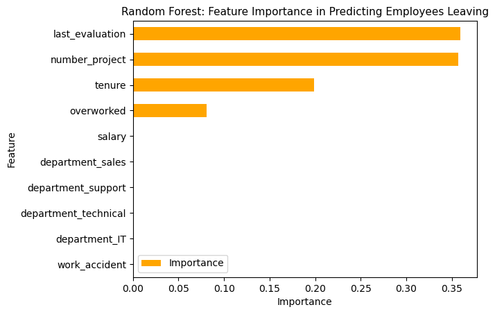
An overview of a comprehensive project aimed at improving employee retention at Salifort Motors. The project utilizes data exploration, analysis, and predictive machine learning models, all implemented using Python.
Data Analysis Using Python
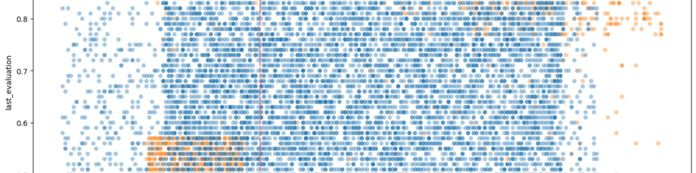
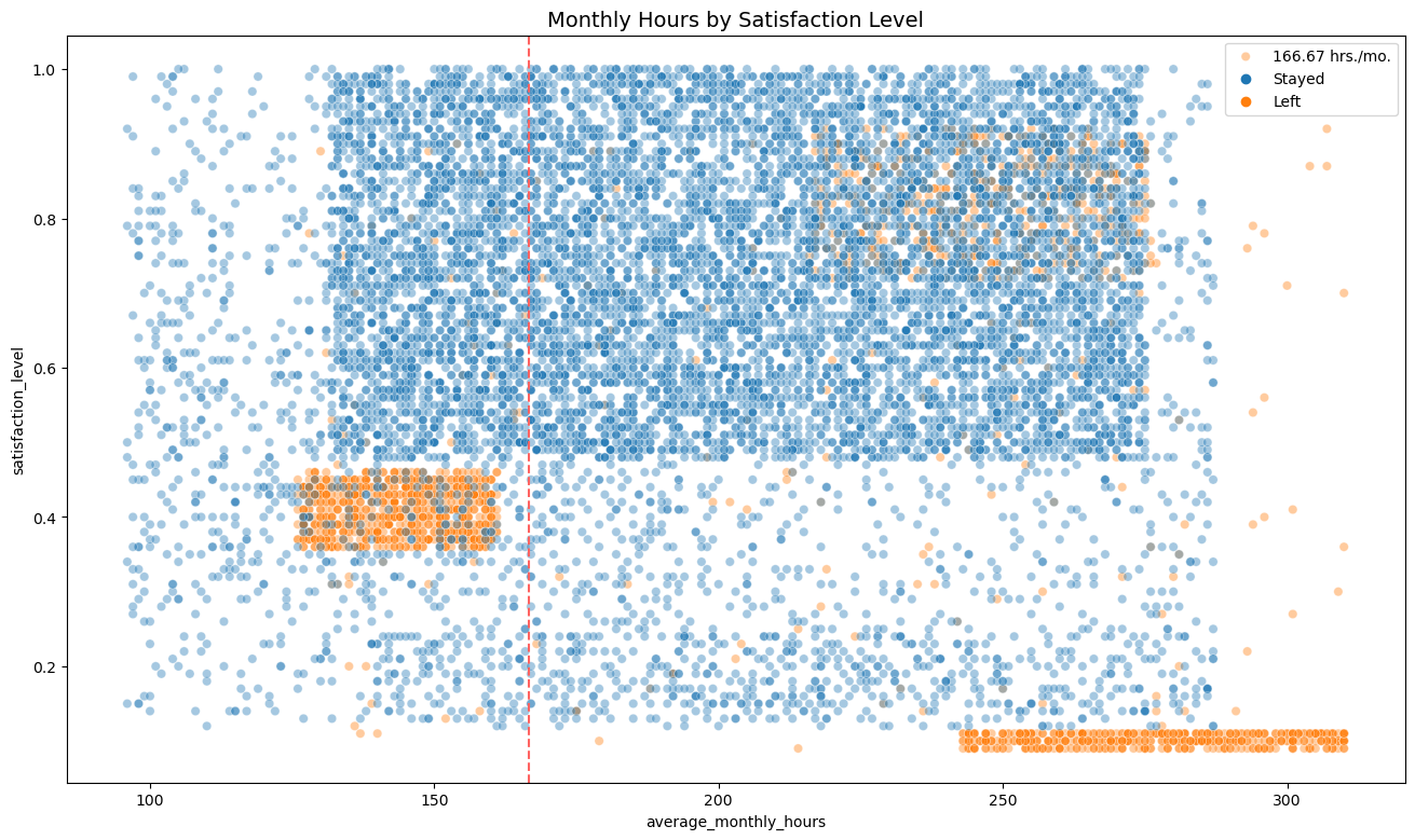
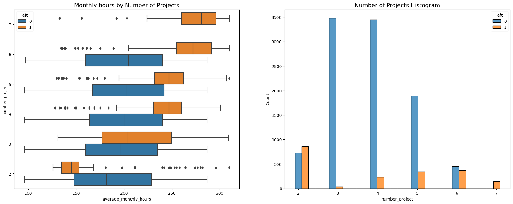
The initial phase of the project involves data exploration and analysis using Python. This process allows us to understand the underlying patterns and trends in our data, which is crucial for determining subsequent steps. We utilize Python libraries such as Seaborn and Matplotlib to create preliminary visualizations, which provide valuable insights into the data.
Project Resources on GitHub
The project repository on GitHub contains four key files:
This project demonstrates the power of data analysis and machine learning in addressing real-world challenges. By leveraging these tools, we can gain valuable insights and make informed decisions to improve employee retention at Salifort Motors.
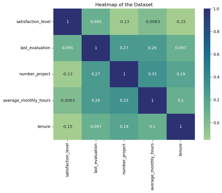
Heatmap of Logistic Regression Dataset:
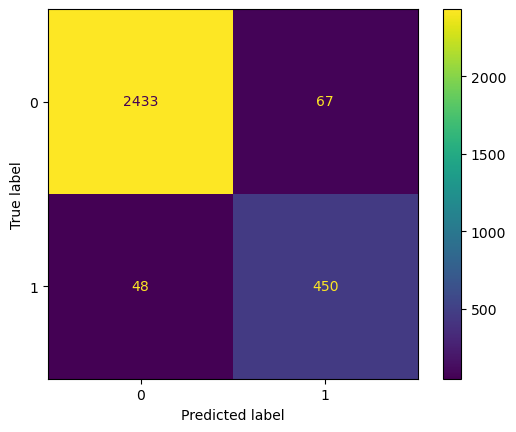
Confusion matrix for random forest machine learning model:
Feature importance for random forest model:


![]()

