

Abstract
Lundbeck’s AI Days offers a practical example of how organizations can approach AI adoption as a structured capability-building effort rather than a simple technology rollout. By connecting AI to business strategy, involving senior leadership, offering hands-on training, and emphasizing responsible use, Lundbeck shows how companies can help employees build confidence while aligning AI experimentation with clear organizational goals. For data and analytics teams, the example reinforces an important point: AI works best when it builds on strong data foundations, clear workflows, sound governance, and measurable business value.
Key Points
Read more: Lundbeck’s AI Days Show How Companies Can Make AI Adoption Practical

Lilly’s TuneLab platform and new AI supercomputing infrastructure enable biotech partners to accelerate drug discovery using secure, high-value machine learning models trained on decades of research data.
Abstract
Eli Lilly has introduced TuneLab, an AI platform that provides biotech companies access to drug discovery models trained on more than $1 billion of proprietary research data. The platform uses federated learning to let partners apply and improve these models without exchanging raw datasets. At the same time, Lilly is building one of the most powerful AI supercomputers in the pharmaceutical industry to support large-scale model development. Together, these moves represent a shift toward AI-augmented scientific workflows, where data, compute, and collaboration accelerate early-stage drug discovery.
Key Points

I completed Personalised Medicine from a Nordic Perspective through the University of Copenhagen and University of Iceland. The course explored how biobanks (collections of biological samples), health registries, and biomarkers (measurable health indicators) can be used to guide individual care, while also addressing risk communication, data protection, and broader ethical considerations.
For a data analyst, this provides valuable context for how health data is generated and applied, and shows the importance of collaboration between doctors and data scientists. The Nordic countries offer a strong case study: they maintain comprehensive health registries and biobanks, and are leaders in responsible data sharing across sectors. The material is presented in a way that makes these complex topics accessible to a broader audience, not just specialists.
This course was built and launched by two principal collaborators, Sisse Rye Ostrowski, MD, University of Copenhagen and Sædís Sævarsdóttir, MD, University of Iceland. They summed up its importance this way:
“The healthcare system is a wonderful place to be if you’re interested in data and developing algorithms. There are extremely complex data like omics data, register data, and data from wearables with all kinds of measurements you could possibly imagine. So, the healthcare field is the data playground of the future.” - Ostrowski
“We want people to understand the challenges involved and how collaboration and technological innovation is the key to shaping the future of healthcare.” - Sævarsdóttir
Explore the Course: Personalised Medicine from a Nordic Perspective
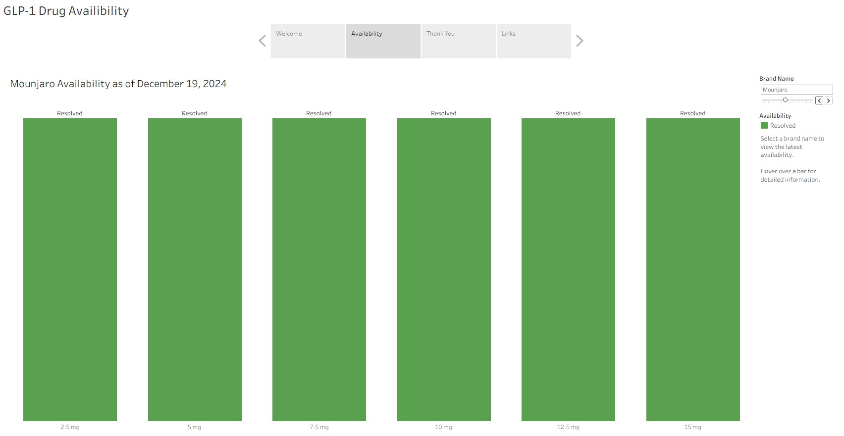
Python and SQLite make drug shortage tracking reliable, efficient, and change-driven.
Avoiding redundant outputs and focusing only on real changes makes drug shortage tracking both more efficient and more reliable. Python and SQLite work together to compare new data with existing records, ensuring updates occur only when needed and visualizations remain clear and accurate.
Key Points
Read more: Streamlined Drug Shortage Tracking with Python and SQLite
Page 2 of 9


![]()
