
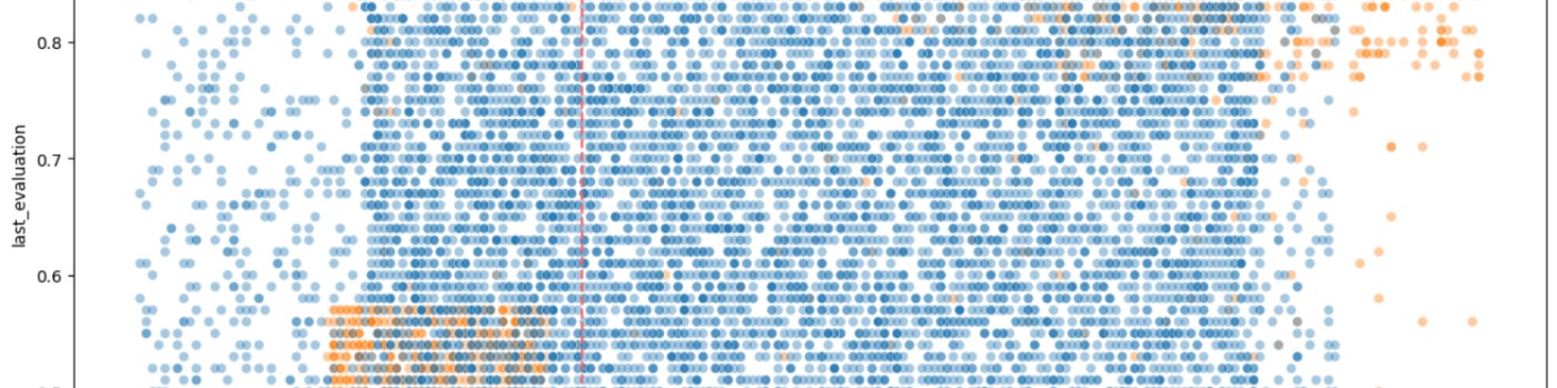
In the era of big data, the ability to transform vast amounts of information into actionable insights is invaluable. Data analysts and business intelligence professionals are constantly seeking ways to streamline their workflows, from data acquisition to visualization. The integration of Artificial Intelligence (AI) into these processes offers a promising avenue for enhancing efficiency, accuracy, and depth of analysis. This blog post explores how AI can augment workflows, facilitate the asking of pertinent questions, and make incremental changes to answer stakeholder questions more effectively, ultimately leading to clearer, more meaningful visualizations in tools such as Tableau or PowerBI.
1. Getting the Data
The foundation of any data analysis project is the data itself. Identifying and acquiring data from various sources such as databases, APIs, and public datasets is the first step. Tools like Python's `requests` library for web APIs, `pandas` for handling CSVs or Excel files, and SQL libraries for interacting with databases are instrumental in loading your data into an analysis-friendly environment. The integration of AI at this stage can streamline the data acquisition process, automating the retrieval and initial processing of data, thus saving valuable time and resources.
2. Data Exploration, Cleaning, and Basic Statistics
Once the data is acquired, the next steps involve exploring, cleaning, and understanding it through basic statistical analysis. Utilizing `pandas` for initial exploration and cleaning tasks such as addressing missing values, duplicates, and outliers prepares the dataset for deeper analysis. AI can play a crucial role here by automating the detection of anomalies and suggesting corrections, significantly reducing the manual effort required in these often-tedious tasks.
3. Loading the Cleaned Dataset into a Large Language Model
Preparing the data for AI involves ensuring it's in a structured format, like a CSV file, for easy ingestion by AI tools or models. This step opens the possibility of interacting with large language models to ask specific questions or request summaries, uncovering additional insights that might not be immediately apparent through traditional analysis methods.
4. Correcting Mis-keyed Data
AI's capability to identify anomalies and inconsistencies can highlight potential errors in the data. This allows for a more focused manual review and correction, or the development of scripts to automate the correction of common mis-keying errors, ensuring the accuracy of the dataset.
5. Ensuring Correct Data Scale
Ensuring that all numerical data are clearly labeled and consistently scaled is crucial for accurate analysis. AI can assist in automatically detecting and correcting scale discrepancies, ensuring consistency across the dataset.
6. Adding New Columns for Enhanced Exploration
AI can suggest new categories or columns that could reveal more insights by analyzing existing patterns and relationships within the data. This can lead to a more nuanced understanding of the dataset, facilitating deeper exploration.
7. Incremental Exploration with AI
AI enables a step-by-step analysis approach, allowing for the progressive exploration of the data. This iterative process, supported by AI's ability to adapt and provide new insights, ensures a thorough understanding of the dataset.
8. Visualizing Results for Stakeholders
Finally, selecting key findings and preparing the data for visualization is crucial. AI can help identify the most relevant insights and ensure the dataset is in a format compatible with visualization tools like Tableau or PowerBI. Creating intuitive and informative visualizations then communicates these findings clearly to stakeholders, enhancing decision-making processes.
Conclusion
The integration of AI into data analysis and visualization workflows represents a significant advancement in the field. By automating repetitive tasks, identifying patterns and anomalies, and suggesting new avenues of exploration, AI not only saves time but also enhances the quality of insights derived from data. As AI technologies continue to evolve, their role in data analysis and visualization is set to become even more pivotal, promising even greater efficiencies and deeper insights. For data analysts and business intelligence professionals, embracing AI is not just an option but a necessity for staying competitive in the fast-paced world of data-driven decision-making.
Frequently Asked Questions
How does AI specifically identify and suggest corrections for anomalies in data?
AI identifies anomalies using machine learning algorithms that can analyze patterns and detect deviations from the norm. Techniques like clustering, anomaly detection algorithms (e.g., Isolation Forest, Autoencoders), and statistical methods are commonly employed. The specific approach depends on the data and the context of the anomalies being sought.
What are the limitations of integrating AI into data analysis workflows?
Integrating AI into data analysis workflows comes with challenges such as ensuring data privacy, mitigating biases in AI models, the need for substantial computational resources, and the requirement for human oversight to interpret and validate AI-generated insights.
Can the AI tools mentioned be integrated with any data visualization software, or are they limited to Tableau and PowerBI?
While many AI tools are designed to be compatible with popular data visualization software like Tableau and PowerBI, the extent of integration can vary. Some AI enhancements might be built-in or available through plugins, while others may require custom integration efforts. The compatibility often depends on the APIs provided by the visualization software and the flexibility of the AI tools.
Data analysts and business analysts share a common goal of improving efficiency and decision-making within an organization using data. They both play crucial roles in driving data-driven decision-making and are often well-compensated for their skills.
Similarities
Intersections
Differences
Data analysts and business analysts are similar in that they both utilize data to support better business outcomes. They intersect in their use of data, analytical skills, and problem-solving abilities. However, they differ in their primary focus, with data analysts being more hands-on with the data and business analysts being more involved in applying data insights to business strategies and processes.
Frequently Asked Questions
What specific educational paths or certifications are most beneficial for someone looking to pursue a career as a data analyst or business analyst?
For data analysts, degrees in computer science, statistics, mathematics, or data science are common, alongside certifications in data analysis tools like SQL, Python, and R. Business analysts often have degrees in business administration, finance, or a related field, with certifications in project management (PMP) and business analysis (CBAP) being advantageous.
How do the salaries and job outlooks for data analysts and business analysts compare, especially given the evolving tech landscape?
Generally, both fields offer competitive salaries that vary by experience, location, and industry. The demand for data analysts and business analysts is expected to grow due to the increasing reliance on data-driven decision-making across sectors.
Can you provide real-world examples or case studies where the collaboration between a data analyst and a business analyst led to significant business improvements?
While specific examples weren't detailed, collaborations between data and business analysts often involve using data insights to refine business strategies, optimize operations, or enhance customer experiences, leading to improved performance and competitiveness.
In the era of COVID-19, data has become a crucial tool in understanding and combating the pandemic. The Public Health Agency of Canada has made available a dataset that provides a comprehensive view of COVID-19 cases in the country. This dataset, updated every Tuesday, is a valuable resource for data analysts of all skill levels, offering insights into the spread and impact of the virus across provinces.
Dataset Overview
The dataset, which is available under the Open Government Licence – Canada, contains information about the number of cases and deaths at the provincial and national levels from January 31, 2020, to the present. As of January 21, 2024, the dataset has 3,090 rows and 23 columns.
Data Analysis and Cleaning with Python
The first step in working with this dataset is to clean and prepare the data for analysis. This process involves several steps, including dropping unnecessary columns and values, renaming columns, and converting data types.
Python Code at GitHub
https://github.com/jsmith6417/Public-Health-Agency-of-Canada-COVID-Cases
Steps:
The 'date' column is not converted to datetime in Python as Tableau automatically converts the text to dates.
Data Visualization with Tableau
Tableau is a powerful tool for creating interactive visualizations. It recognizes 'Country' and 'Province' as a hierarchy, making it easy to create a color-coded map of Canada. Two True/False calculated fields are created to filter out case counts equal to zero and death counts equal to zero:
- Cases > 0: `[numtotal_last7] > 0`
- Deaths > 0: `[numdeaths_last7] > 0`
Steps:
Visualizations at Tableau Public
This dataset is a good resource for practicing analysis and cleaning in Python, and for creating calculated fields, sorting, grouping, and visualizing the data in Tableau. Map labels are in the tooltips to keep the presentation free of clutter.
Frequently Asked Questions
How did you decide which columns were unnecessary and should be dropped?
Since the data is updated weekly, I decided to keep only the columns with counts and rates for the last 7 days to shrink and simplify the dataset.
We have the date reported, so the reporting week and reporting year columns are not needed.
The 'pruid' and 'update' columns are for internal tracking and not necessary for creating visualizations.
The 'prnameFR' is province names in French. Since we already have the province names in English, these are not needed.
How did you handle missing or incomplete data in the dataset?
I filled in missing and non-numeric values for the counts (such as dashes) first with NA, then converted any NA values to zero.
What were the criteria for creating the True/False calculated fields in Tableau?
Checking values for each of the count columns and noting if they're greater than zero. Tableau will recognize this as boolean (T/F).
For cases > 0: [numtotal_last7] > 0
For deaths > 0: [numdeaths_last7] > 0

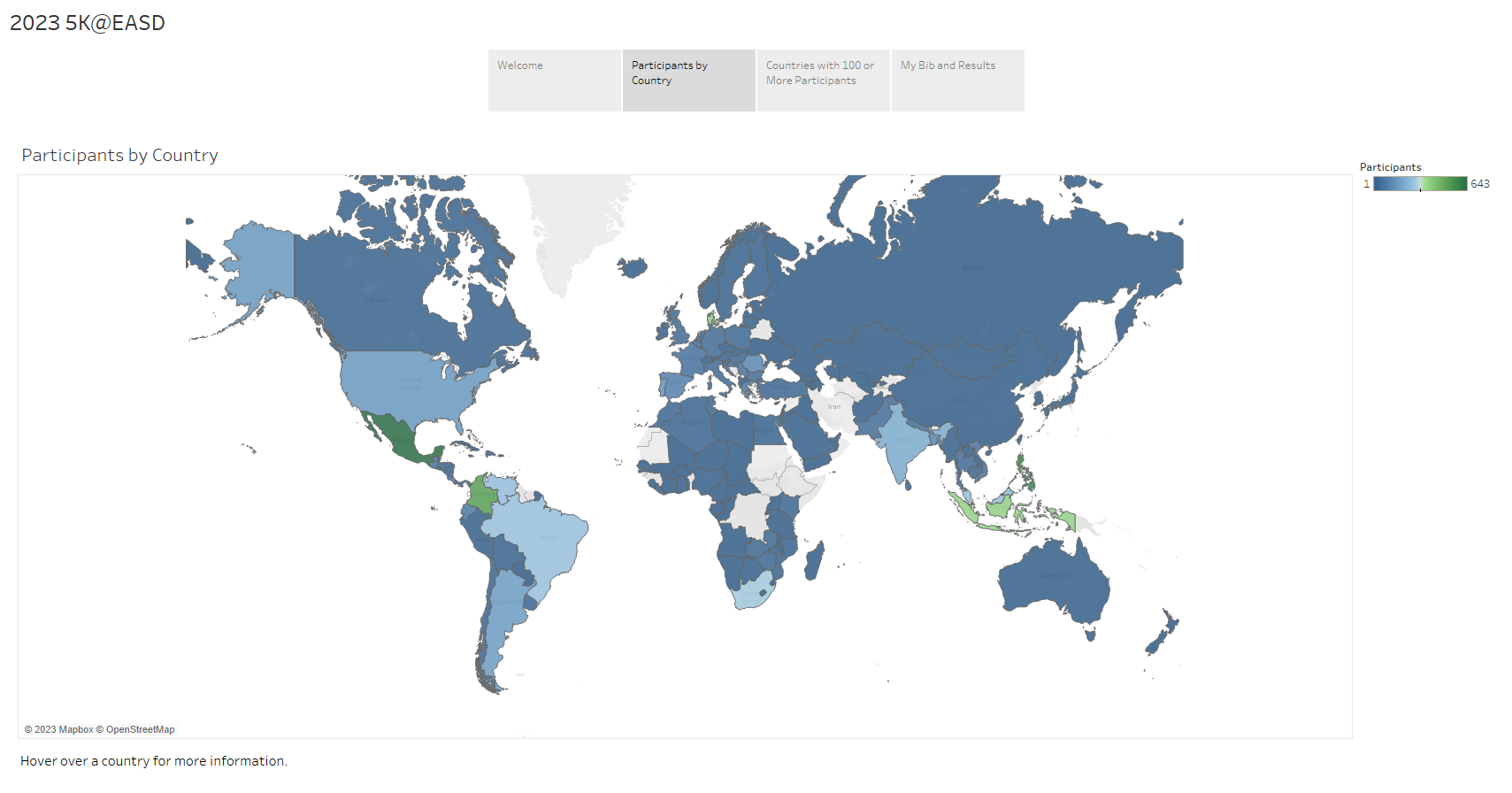
Delve into the fascinating statistics from the 2023 5K@EASD virtual run. This analysis serves as a testament to the power of Tableau, a tool that allows us to visualize and understand data in a matter of minutes.
You can explore the full analysis in our 5K@EASD Story Points on Tableau Public.
Story Points Breakdown
We hope this analysis provides you with a clear understanding of the 2023 5K@EASD virtual run's reach and impact. We also hope it demonstrates the potential of Tableau as a powerful tool for data visualization and analysis.
Page 7 of 9


![]()
