
- Details
- By J. Smith
- Hits: 602
A Tableau Case Study Using Continuous Glucose Monitor Data
Thoughtful visualization design turns CGM data into clearer insight by showing when patterns occur, how stable they are, and how design choices influence the way people interpret the data.
Summary
A visualization can be mathematically correct and still hide part of the story.
Daily Time in Range and glucose variation summaries are useful, but they compress an entire day into a small number of values. They show what happened overall without necessarily showing when patterns occurred, whether they repeated, or how stable glucose was during particular parts of the day.
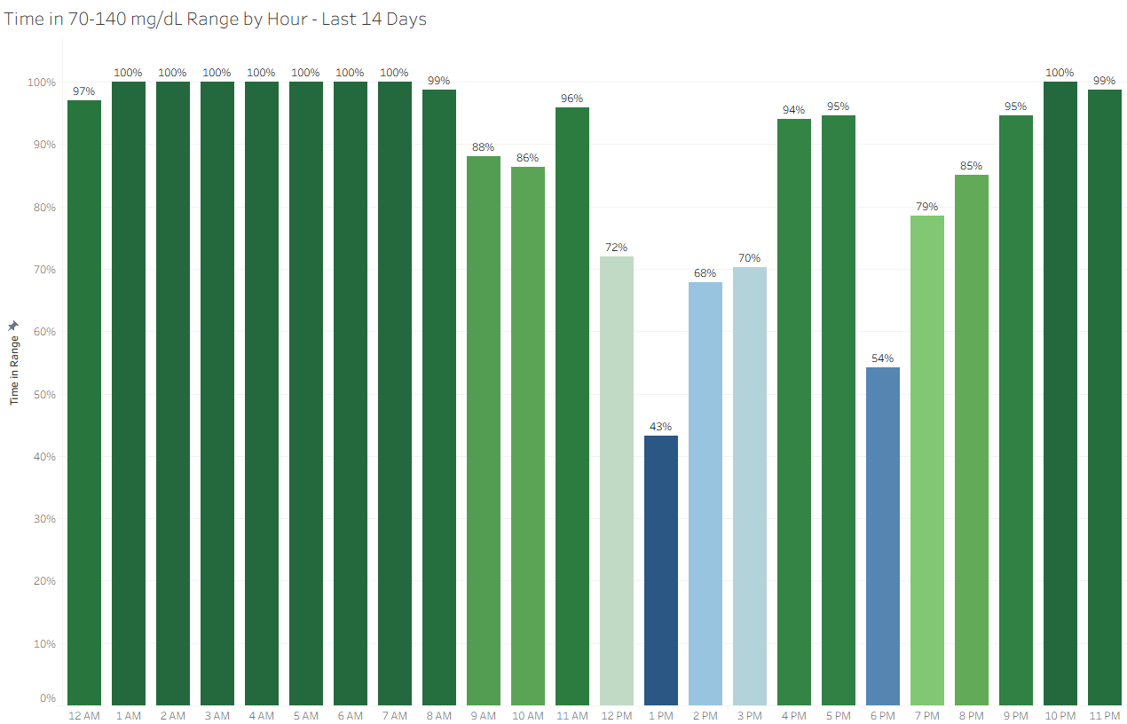
Time in Range by Hour and Variation by Hour approach the same data at a different level of aggregation. By grouping readings by hour of day and viewing those hours across multiple days, the visualizations add timing, recurrence, and stability to the analysis.
The project also illustrates a broader analytics principle: good visualization design is not only about displaying accurate numbers. It is about choosing the level of detail, supporting metrics, calculation structure, visual encoding, and context that best answer the question.
Key Points
- Daily summaries answer one question, but not every question. A daily Time in Range percentage shows the overall result but not when glucose patterns occurred.
- Hourly aggregation adds time-of-day context. Grouping readings by hour can reveal patterns that disappear when the entire day is summarized.
- Multi-day aggregation helps reveal recurrence. Viewing hourly results across 7, 14, 30, or 90 days can help distinguish persistent patterns from isolated events.
- Time in Range and Variation work better together. One shows where glucose is landing. The other shows how consistently it behaves during the same periods.
- Calculation structure matters. Shared hourly bins, consistent aggregation, explicit rounding where appropriate, filters, and sorting help make the views comparable and reproducible.
- Visualization design affects interpretation. Color, labels, aggregation, and chart structure influence what the audience notices and what conclusions they may draw.
- Evidence boundaries matter too. A thoughtful design may support more contextual interpretation, but that does not mean its emotional or behavioral effects have already been demonstrated..
Read more: Designing Visualizations That Help People Understand the Data