
A Tableau Case Study Using Continuous Glucose Monitor Data
Thoughtful visualization design turns CGM data into clearer insight by showing when patterns occur, how stable they are, and how design choices influence the way people interpret the data.
Summary
A visualization can be mathematically correct and still hide part of the story.
Daily Time in Range and glucose variation summaries are useful, but they compress an entire day into a small number of values. They show what happened overall without necessarily showing when patterns occurred, whether they repeated, or how stable glucose was during particular parts of the day.
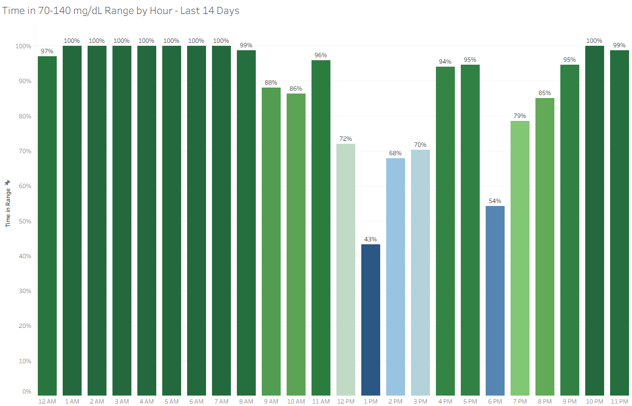
Time in Range by Hour and Variation by Hour approach the same data at a different level of aggregation. By grouping readings by hour of day and viewing those hours across multiple days, the visualizations add timing, recurrence, and stability to the analysis.
The project also illustrates a broader analytics principle: good visualization design is not only about displaying accurate numbers. It is about choosing the level of detail, supporting metrics, calculation structure, visual encoding, and context that best answer the question.
Key Points
- Daily summaries answer one question, but not every question. A daily Time in Range percentage shows the overall result but not when glucose patterns occurred.
- Hourly aggregation adds time-of-day context. Grouping readings by hour can reveal patterns that disappear when the entire day is summarized.
- Multi-day aggregation helps reveal recurrence. Viewing hourly results across 7, 14, 30, or 90 days can help distinguish persistent patterns from isolated events.
- Time in Range and Variation work better together. One shows where glucose is landing. The other shows how consistently it behaves during the same periods.
- Calculation structure matters. Shared hourly bins, consistent aggregation, explicit rounding where appropriate, filters, and sorting help make the views comparable and reproducible.
- Visualization design affects interpretation. Color, labels, aggregation, and chart structure influence what the audience notices and what conclusions they may draw.
- Evidence boundaries matter too. A thoughtful design may support more contextual interpretation, but that does not mean its emotional or behavioral effects have already been demonstrated..
The Design Problem
Daily Time in Range is useful. It tells us what percentage of time glucose readings stayed within a selected target range.
But a daily percentage does not show timing.
A lower Time in Range value might reflect a broad pattern lasting much of the day. It might also reflect one recurring period, such as after a meal. Two days can produce similar daily percentages while having very different patterns underneath.
Daily variation has a similar limitation. It can describe how much glucose fluctuated across the day without showing when glucose was relatively stable and when variation increased.
The problem is not that the daily metrics are wrong.
The problem is that they answer a different question.
Instead of asking only:
What was the daily result?
the visualization project asks:
When did the pattern occur, did it recur, and how stable was glucose during the same period?
That change in question changes the level of aggregation the visualization needs.
Daily → Hourly → Multi-Day: Choosing the Right Aggregation
One of the most important decisions in data visualization happens before formatting the chart:
At what level should the data be summarized?
For this project, three levels provide different kinds of information.
Daily: Summary
A daily view reduces the day to one summary value.
That makes the result familiar and easy to compare from one day to another, but it also removes time-of-day detail. A value can show that something changed without showing where the change occurred.
Hourly: Context
An hourly view divides the day into consistent time periods.
Time in Range by Hour calculates the percentage of readings within the selected range during each hour. Variation by Hour calculates glucose variability for those same hourly periods.
That adds context because changes can now be located in time.
Instead of knowing only that Time in Range was lower, the viewer may see that most hours remained relatively consistent while one period repeatedly differed.
Multi-Day: Pattern
A single day's hourly view still reflects the circumstances of that particular day.
Meals, activity, sleep, stress, illness, medication timing, sensor behavior, and normal day-to-day variation can all influence the result.
Aggregating the same hourly periods across multiple days helps answer a different question:
Does this tend to happen at this time?
That creates a useful progression:
Daily → Hourly → Multi-Day
Summary → Context → Pattern
The right level of aggregation depends on the question.
More detail is not automatically better, and neither is more aggregation. Each level reveals something while potentially hiding something else.
Pairing Time in Range with Variation
Time in Range by Hour
Question: How often are readings in range?
Shows where glucose is landing
Identifies periods with higher or lower TIR
Variation by Hour
Question: How stable are readings?
Shows how consistently it stays there
Identifies periods with higher or lower variability
Together: location + stability = better context
Tableau Design Structure
The Time in Range and Variation views use the same hourly structure.
That consistency matters because the charts are intended to be read together. If one view defines time differently from the other, comparison becomes harder to interpret and harder to trust.
Creating the Hourly Bins
The first calculated field rounds each reading down to the beginning of its hour:
Time Bins 60
DATETIME(DATETRUNC('hour', [Date Time]))This creates consistent hourly bins from the original datetime values. For example, readings recorded at 9:05 AM, 9:25 AM, and 9:55 AM all belong to the same 9:00 AM hour.
The field can remain in Tableau's Automatic format.
A second calculated field extracts the time portion for display:
Time NB 60
FLOAT([Time Bins 60]) - INT([Time Bins 60])This field uses the custom format:
H AMPM
That produces familiar hour labels such as 9 AM, 10 AM, or 3 PM while preserving the underlying time logic used by the visualization.
The technical implementation is relatively simple, but its analytical importance is larger.
Both visualizations should use:
- the same hourly boundaries
- the same chronological hour order
- the same reporting-window filters
- the same underlying time logic
- consistent display conventions
Otherwise, visual similarities between the charts may imply comparisons that the calculations do not actually support.
Calculating Coefficient of Variation
Variation by Hour uses coefficient of variation, calculated as standard deviation divided by average glucose:
Coefficient of Variation
[Standard Deviation] / [Average Glucose]The field is formatted as a percentage with one decimal place.
The supporting average-glucose calculation is:
Average Glucose
AVG([Value])with the custom number format:
#,##0 mg/dL;-#,##0 mg/dL
This displays average glucose as a whole-number value with the appropriate unit.
Handling Standard Deviation Consistently
The standard deviation calculation uses explicit rounding:
Standard Deviation
ROUND(STDEV([Value]),0)The field is formatted as a custom number with zero decimal places.
The explicit ROUND() is intentional.
Formatting a number to zero decimal places changes how Tableau displays the value. It does not necessarily change the underlying floating-point value that later calculations use.
That distinction can matter when another calculated field depends on the result.
For example, two platforms might hold values that appear effectively identical:
| Tableau: | 74.4999997 |
| Other Platform: | 74.5000000 |
but later rounding could produce:
| Tableau: | 74 |
| Other Platform: | 75 |
Using explicit rounding at the standard-deviation stage reduces the possibility that small floating-point differences propagate into downstream calculations. It also makes validation against another platform where the calculation is already known to be correct more straightforward.
This illustrates an important Tableau distinction:
Number formatting controls appearance. ROUND() controls the value used by later calculations.
Explicit rounding is not automatically necessary for every calculated field. In this case, it provides a defined whole-number standard deviation that can be displayed, reused in the coefficient-of-variation calculation, and compared consistently with results from another platform.
Why the Calculation Structure Matters
None of these calculated fields is especially complicated on its own.
The important part is how they work together.
The hourly bin establishes a common time structure. Average glucose and standard deviation summarize the readings within that structure. Coefficient of variation then adds a relative measure of stability.
That produces two visualizations based on the same underlying temporal framework:
- Time in Range by Hour shows where glucose tends to land.
- Variation by Hour shows how consistently glucose behaves during those same hours.
The calculations support the visual design, but they also illustrate a broader analytical principle:
Simple calculated fields can produce meaningful analysis when their definitions, aggregation levels, and dependencies are carefully controlled.
Reporting Windows and Data Coverage
The visualizations allow the same hourly patterns to be viewed across 7, 14, 30, or 90 days.
Those periods should not be treated as interchangeable.
7 Days: Responsive
A shorter reporting period is more sensitive to recent changes.
That can be useful when the goal is to understand what has happened recently, but individual days also have greater influence on the result.
14 Days: Useful Anchor
Fourteen days provides a familiar CGM reporting window and aligns with international consensus guidance for evaluating representative CGM patterns when sufficient data are available.
It can provide a useful balance between recent behavior and repeated observations.
30 Days: Persistence
A 30-day view gives individual days less influence and can make persistent time-of-day patterns easier to recognize.
The trade-off is that recent changes begin to contribute less to the overall picture.
90 Days: Longer-Term Context
A 90-day view provides the greatest smoothing of the available options.
That can reveal longer-term persistence, but greater smoothing can also conceal meaningful recent changes.
This leads to another design principle:
A longer reporting window is not automatically a better reporting window.
The appropriate period depends on whether the analytical question concerns recent change, recurring behavior, or longer-term persistence.
Data Coverage Matters
Aggregation also depends on the quality and completeness of the underlying data.
Missing readings, gaps in sensor wear, or uneven device use may leave some hourly periods better represented than others. A result calculated from limited observations should not automatically be interpreted with the same confidence as one supported by consistent coverage.
That means the visualization should be considered alongside questions such as:
- How many days contributed data?
- Were some hours consistently missing?
- Were there extended gaps in sensor use?
- Does the selected reporting period contain enough representative data?
- Could one unusual day still have disproportionate influence?
Aggregation can reduce noise.
It cannot repair missing or unrepresentative data.
Color Is Not Neutral
One of the most deliberate design choices in the project is the green-to-blue color scale.
A green-to-red or green-to-orange scale might provide strong visual separation, but those colors also carry familiar meanings. Green often signals success. Red often signals failure, warning, or error.
Those associations can affect interpretation even when the underlying data does not justify that judgment.
The hourly visualizations use a more neutral green-blue scale.
Across the two views:
- Greener tones indicate more Time in Range or lower variation.
- Bluer tones indicate less Time in Range or higher variation.
The colors still communicate differences. They simply avoid intentionally assigning a success-or-failure message to them.
This is relevant well beyond CGM data.
Color is not decoration.
Color is an encoding, and every encoding brings meaning with it. Sometimes that meaning comes from the analyst. Sometimes it comes from conventions the audience already knows.
Good visualization design considers both.
Designing for the Audience
A technically accurate visualization can still fail if it does not fit the people using it.
Different audiences bring different questions to the same chart.
A data analyst may focus on calculations, bins, filters, data quality, and aggregation.
A healthcare professional may focus on recurring patterns that support discussion and decision-making.
A person living with diabetes may see information that is much more personal.
The underlying numbers have not changed, but the context has.
Analyst Perspective
- Structure
- Calculations
- Aggregation
- Filters
- Consistency
Viewer Perspective
- What does this mean?
- What should I notice?
- Is this a pattern or noise?
- Does the design imply judgment?
That does not mean a visualization should hide difficult information or make unfavorable patterns look better than they are.
It means the design should communicate the information accurately without adding implications that the data itself does not support.
For this project, that means:
- showing timing rather than only a whole-day result
- distinguishing recurring patterns from isolated events
- pairing location with stability
- avoiding unnecessarily judgment-oriented color conventions
- providing enough context to support interpretation
- making clear what the visualization can and cannot establish
The audience matters.
The analytical purpose matters.
How the visualization may be interpreted matters.
That is why visualization design requires more than technical correctness.
It requires judgment.
Evidence and Design Boundaries
The rationale behind these visualizations draws on several established ideas.
Research supports the clinical usefulness of Time in Range and glucose variability. Research also shows that CGM data can carry emotional meaning for people using it, while diabetes communication guidance recommends avoiding language that frames glucose results as personal success or failure.
Those findings help explain why the presentation of glucose data deserves attention.
They do not, however, demonstrate that these specific hourly visualizations reduce diabetes distress, perceived judgment, or emotional burden.
No study identified for the companion JCS/T2D review directly compared a single daily Time in Range display with Time in Range and variation aggregated by hour across multiple days.
That distinction is important.
The visualizations are designed to provide timing, recurrence, and context. The idea that this framing may also feel less evaluative is an evidence-informed design hypothesis, not an established outcome.
That is another analytics lesson worth carrying beyond this project:
Separate what the data demonstrates from what the design is intended to accomplish.
A plausible design rationale should not quietly become a proven claim.
The Broader Analytics Lesson
This project uses CGM data, but the underlying visualization lessons apply much more broadly.
Visualizations are not simply the final output of an analysis.
They are part of the analytical process.
A visualization determines what gets emphasized, what gets aggregated, what gets compared, and what the audience can reasonably infer.
Questions to Ask Before You Publish a Visualization
- What question is the visualization actually trying to answer?
- What level of aggregation supports that question?
- What detail would add useful context?
- What detail would add only noise?
- Would a second metric improve interpretation?
- Are the measures being compared using consistent logic?
- Do upstream calculations have the precision needed by downstream calculations?
- Does the reporting window fit the question?
- Is the underlying data representative?
- What do the labels and colors imply?
- What might the audience conclude that the data does not actually establish?
These are not cosmetic decisions.
They shape the analysis the audience receives.
Why This Matters
Data visualization is sometimes treated as the last step of analysis:
Prepare the data.
Run the calculations.
Build the chart.
Publish the result.
But visualization is not simply a presentation layer.
It is also an interpretation layer.
In this project, changing from a daily summary to multi-day hourly views changes the questions the audience can ask.
Instead of stopping with:
What was the Time in Range?
the analysis can continue:
When did the pattern occur?
Did it recur?
How stable was glucose during that period?
That does not make the daily summary unnecessary. It puts the summary in context.
And that is the broader goal of thoughtful visualization design: not to show more data simply because more data exists, but to show the information needed to understand the question more clearly.
When that happens, visualization becomes more than reporting.
It becomes communication.
Related Work
Want to explore the visualization design?
For a closer look at the data visualization design behind these hourly CGM views, see the companion JCS/T2D article: