A Tableau Case Study Using Continuous Glucose Monitor Data
Thoughtful visualization design turns CGM data into clearer insight by showing when patterns occur, how stable they are, and how design choices influence the way people interpret the data.
Summary
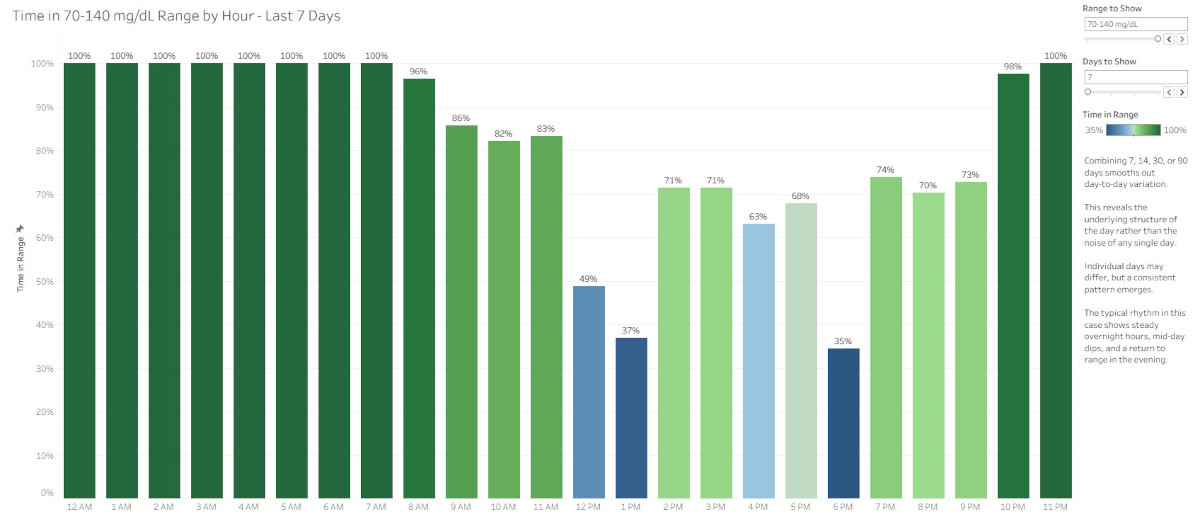
Thoughtful data design makes complex patterns easier to understand. Hourly Time in Range and Variation by Hour views can reveal glucose patterns that daily summaries often hide, while choices around aggregation, paired metrics, color, and audience context shape whether data feels like judgment or useful information.
Key Points
Daily summaries can hide important timing patterns. A single Time in Range percentage may be useful, but it doesn’t show when glucose patterns occur.
Hourly aggregation provides better context. Grouping CGM readings by hour helps reveal recurring patterns across 7, 14, 30, or 90 days.
Time in Range and Variation work better together. Time in Range shows how often readings stay within range, while Variation by Hour shows how stable those readings are.
Visualization design choices affect interpretation. Color scales, labels, aggregation, and chart structure influence whether viewers see pattern, noise, pressure, or context.
Good analytics requires audience awareness. A chart should not only be accurate. It should fit the audience, the purpose, and the way the information may land.