JCS Analytics
JCS Analytics
  • Home
  • About
  • Privacy

JCS Analytics - We are analysts. We Ask. We Automate. We Discover.

Details
By J. Smith
J. Smith
Articles
January 6,2024
Last Updated: 03 March 2024
Hits: 1394
  • Tableau
  • DATETRUNC
  • Calculated Field

Creating a Calculated Field in Tableau to Get Get Data Aggregated by Month in the Correct Order

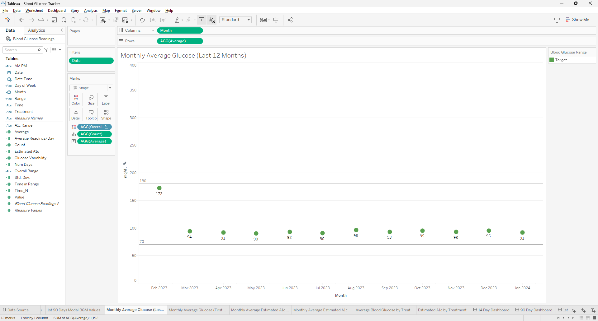
Creating a visualization for the most recent 12 months in Tableau can be a common requirement for time series analysis. To achieve this, you can use the `DATETRUNC` function to truncate your date data to the first day of each month, ensuring that your months will be in the correct order when aggregated. Here's how to use the `DATE(DATETRUNC('month',[Date]))` function effectively in Tableau for this purpose.

Understanding the DATETRUNC Function

The `DATETRUNC` function in Tableau truncates a given date to the specified date part, such as the year, quarter, or month. When you use `DATETRUNC('month', [Date])`, it will return the first day of the month for each date in your dataset. This is useful for creating consistent monthly data points for visualization purposes.

Steps

  1. Create a Calculated Field: In Tableau, create a new calculated field using the formula `DATE(DATETRUNC('month',[Date]))`. This will convert all dates in your dataset to the first of their respective months, without including the time along with the date. Only the date is necessary.
  2. Apply a Relative Date Filter: To focus on the most recent 12 months, apply a relative date filter to your worksheet. Add the date dimension to the filter and select 'relative date', then choose 'last twelve months'. This filter will automatically update as time progresses, ensuring that your visualization always represents the latest 12-month period.
  3. Use the Calculated Field in Your Visualization: Drag your new calculated field to the appropriate shelf (usually Columns) to use it as the axis for your visualization. This will ensure that your data is aggregated by the truncated month date, which will sort the months in chronological order.
  4. Adjust Aggregation as Needed: If you need to aggregate your data in a specific way (e.g., sum, average), make sure to adjust the aggregation settings for your measure values accordingly.
  5. Customize Your Visualization: You can now build your visualization as desired, whether it's a line chart, bar chart, or any other type that benefits from a monthly time series analysis.

Benefits of Using DATETRUNC

  • Consistency: By truncating dates to the first of the month, you ensure that each month is represented consistently, which is crucial for accurate comparisons and trend analysis.
  • Ordering: Truncated dates will naturally fall into chronological order, which is essential for time series visualizations.
  • Flexibility: You can easily adjust the level of date truncation (e.g., to quarters or years) if you need to analyze your data at a different granularity.

Using the `DATE(DATETRUNC('month',[Date]))` function in Tableau is a powerful way to prepare your data for visualizations that require monthly aggregation. It ensures that your months are in order and that your visualization reflects the most recent 12-month period. This approach is part of Tableau's robust time series analysis capabilities, which allow for insightful trend spotting and variance analysis over time.

Frequently Asked Questions

Can this method be applied to other time units (like weeks or days) and if so, how would the approach change? 
The DATETRUNC function can indeed be applied to other time units such as weeks or days. The approach remains similar, but the unit of truncation in the function needs to change (e.g., 'week' or 'day') to reflect the desired aggregation level.

How can you use the calculated field created with DATETRUNC in Tableau to compare year-over-year data? 
To compare year-over-year data using DATETRUNC, you can create separate calculated fields for the current and previous years by manipulating the date part of your DATETRUNC calculation. Then, use these fields in your visualization to compare performance across different years.

What are the best practices for ensuring that the date formatting in the calculated field matches the rest of the dashboard elements in Tableau?
Best practices for consistent date formatting include setting the default date format in the data source, using calculated fields to standardize date formats, and applying consistent formatting settings across dashboard elements directly within Tableau's format options.


Details
By J. Smith
J. Smith
Articles
November 24,2024
Last Updated: 24 April 2025
Hits: 668
  • Continuous Glucose Monitoring
  • CGM Data Visualization
  • Data Analysis with Tableau
  • Time in Range Metrics
  • Glycemic Variability

Working with CGM Data: Part 4 – Visualizing the Data in Tableau

Profile

Abstract

This post concludes the "Working with CGM Data" series by demonstrating how to create insightful visualizations in Tableau using continuous glucose monitor (CGM) data. It covers two visualization categories—CGM-style and data analysis-style—and highlights their unique features and applications. Advanced Tableau techniques, including calculated fields and dynamic parameters, ensure precise and actionable insights. This guide demonstrates how to translate raw CGM data into actionable visual reports, creating a framework for analyzing glucose management trends.

Key Points

  • Focus on Visualizing CGM Data: Demonstrates advanced Tableau techniques to create CGM-style and data analysis-style visualizations.
  • Categories of Visualizations:
    • CGM-Style Reports: Overview, Daily View, Comparison, Overlay, and Profile reports mimic traditional CGM reporting formats.
    • Data Analysis-Style Reports: Range and Variation, Variation by Time of Day, and experimental Time in Tight Range metrics for deeper insights.
  • Advanced Tableau Features: Includes 55 calculated fields, 7 parameters, and precision techniques such as dynamic GMI calculations for increased usability.
  • Insights Gained: Explores metrics like Time in Range, Coefficient of Variation, and glucose patterns to provide comprehensive data-driven insights.
  • Interactive Online Dashboards: Visualizations are accessible on Tableau Public for exploration and reference.
  • Not for Medical Use: Visualizations focus on data analysis and are not intended for guiding treatment decisions.

Read more: Working with CGM Data: Part 4 – Visualizing the Data in Tableau

Details
By J. Smith
J. Smith
Articles
November 24,2024
Last Updated: 21 December 2025
Hits: 683
  • CGM Data Processing
  • SQLite Database Management
  • Continuous Glucose Monitoring
  • Data Cleaning Techniques
  • Tableau Visualization Prep

Working with CGM Data: Part 3 - Cleaning and Processing New Data with Python and SQLite

# Import packages

# For data manipulation
import numpy as np
import pandas as pd

# For working with datetime objects
from datetime import datetime

# For working with SQLite databases
import sqlite3

Abstract

Establishing a reliable and efficient process for managing continuous glucose monitor (CGM) data ensures the dataset remains accurate, consistent, and manageable. Using Python and SQLite, new data is cleaned, validated , and added to the database, and prepped for visualizations in Tableau.

Key Points

  • Data Storage: Only the most recent 90 days of CGM data are stored in the SQLite database, optimizing storage and focusing on relevant data.
  • Data Validation: Duplicate entries are removed, missing dates are identified, and the dataset remains complete.
  • Efficient Integration: New data is appended to the existing database without overwriting or redundancy.
  • Prepared for Visualization: Cleaned and validated data is ready for use in visualization tools like Tableau.

Read more: Working with CGM Data: Part 3 - Cleaning and Processing New Data with Python and SQLite

Details
By J. Smith
J. Smith
Articles
November 23,2024
Last Updated: 21 December 2025
Hits: 555
  • Python
  • SQLite
  • SQL Magic
  • CGM Data Handling
  • Data Validation

Working with CGM Data: Part 2 – Creating a Database with SQLite to Manage a Growing Dataset

# Import packages

# For data manipulation
import pandas as pd

# For working with SQLite databases
import sqlite3

Abstract

Explore the use of Python, SQLite, and SQL Magic to manage growing datasets efficiently.

Key Points

  • Problem Addressed: Managing a growing CGM dataset efficiently, moving beyond CSV files to a scalable database solution.
  • SQLite for Scalability: SQLite's serverless nature and Python integration make it an ideal choice for local data management and rapid deployment.
  • Using SQL Magic: SQL Magic in Jupyter Notebook allows for interactive SQL queries, combining Python’s flexibility with SQL’s powerful capabilities.

Read more: Working with CGM Data: Part 2 – Creating a Database with SQLite to Manage a Growing Dataset

  • 1
  • 2
  • 3
  • 4
  • 5
  • 6
  • 7
  • 8
  • 9

Page 8 of 9

Recent Activity

June 2026

  • Novo Nordisk IT Incident Shows Why Pseudonymized Data Still Requires Serious Protection

May 2026

  • Lundbeck’s AI Days Show How Companies Can Make AI Adoption Practical
  • Sovereign AI Infrastructure and the New Shape of AI Strategy
  • Why I Take Medical Courses as a Data Analyst

April 2026

  • Novo Nordisk Expands Its AI Strategy Through New OpenAI Partnership

Articles

  • 5K@EASD Race Results: Trends from 2023 and 2024
  • Adapting the 5K@ADA Race Results Project for 2025
  • Advanced Data Retrieval with Python
  • Aligning CGM and BGM Readings Using Python and Tableau
  • Analysis and Visualization of Public Health Agency of Canada COVID Cases
  • Bridging Data and Healthcare in the Nordics
  • Complex Web Scraping with Python
  • Creating a Calculated Field in Tableau to Get Get Data Aggregated by Month in the Correct Order
  • Data Analyst vs. Business Analyst: Similarities and Differences
  • Data Analytics for Type 2 Diabetes
  • Data Science and Responsible AI in the Pharmaceutical Industry: A Case Study of Novo Nordisk
  • Denmark's Leap into AI Innovation: A Model for Future Research and Development
  • Denmark’s Gefion AI Supercomputer Revolutionizes AI-driven Research
  • Eli Lilly’s AI Strategy: Opening High-Value Drug Discovery Models to the Biotech Ecosystem
  • Embracing AI: Balancing Augmentation, Ethics, and Environmental Impact
  • Enhancing Data Analysis and Visualization Workflows with AI
  • Exploring the 2023 5K@EASD Virtual Run: A Tableau Analysis
  • Exploring the Growth of GLP-1 RA Sales
  • How Novo Nordisk is Utilizing AI for Drug Discovery
  • How TELUS Transformed Data Analysis with Contact Center AI

Top Subjects

  • Tableau
  • Python
  • Data Analytics
  • Novo Nordisk
  • Tableau Visualizations
  • AI
  • 5K@EASD
  • Data Analysis
  • Data Visualization
  • 5K@ADA
  • Type 2 Diabetes
  • Data Cleaning
  • Data Analyst
  • Drug Discovery
  • AI Innovation
  • Quantum Computing
  • Diabetes Management
  • Race Results
  • Diabetes Awareness
  • Virtual 5K
  • SQLite
  • SQLite Database Management
  • Continuous Glucose Monitoring
  • Artificial Intelligence
  • AI in Healthcare
  • Healthcare Analytics
  • Healthcare Data
  • AI in Drug Discovery
  • NVIDIA
  • Responsible AI

Contact Me

Search

End Diabetes Stigma

5K@ADA

5K@EASD

World Diabetes Day

Rochen Web Hosting

Bluesky Social

  • You are here:  
  • Home
  • Articles
 
Copyright © 2026 JCS Analytics. All Rights Reserved.
Joomla! is Free Software released under the GNU General Public License.