
In the era of COVID-19, data has become a crucial tool in understanding and combating the pandemic. The Public Health Agency of Canada has made available a dataset that provides a comprehensive view of COVID-19 cases in the country. This dataset, updated every Tuesday, is a valuable resource for data analysts of all skill levels, offering insights into the spread and impact of the virus across provinces.
Dataset Overview
The dataset, which is available under the Open Government Licence – Canada, contains information about the number of cases and deaths at the provincial and national levels from January 31, 2020, to the present. As of January 21, 2024, the dataset has 3,090 rows and 23 columns.
Data Analysis and Cleaning with Python
The first step in working with this dataset is to clean and prepare the data for analysis. This process involves several steps, including dropping unnecessary columns and values, renaming columns, and converting data types.
Python Code at GitHub
https://github.com/jsmith6417/Public-Health-Agency-of-Canada-COVID-Cases
Steps:
The 'date' column is not converted to datetime in Python as Tableau automatically converts the text to dates.
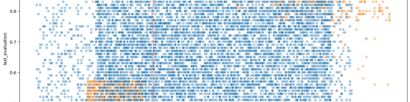
Data Visualization with Tableau
Tableau is a powerful tool for creating interactive visualizations. It recognizes 'Country' and 'Province' as a hierarchy, making it easy to create a color-coded map of Canada. Two True/False calculated fields are created to filter out case counts equal to zero and death counts equal to zero:
- Cases > 0: `[numtotal_last7] > 0`
- Deaths > 0: `[numdeaths_last7] > 0`
Steps:
Visualizations at Tableau Public
This dataset is a good resource for practicing analysis and cleaning in Python, and for creating calculated fields, sorting, grouping, and visualizing the data in Tableau. Map labels are in the tooltips to keep the presentation free of clutter.
Frequently Asked Questions
How did you decide which columns were unnecessary and should be dropped?
Since the data is updated weekly, I decided to keep only the columns with counts and rates for the last 7 days to shrink and simplify the dataset.
We have the date reported, so the reporting week and reporting year columns are not needed.
The 'pruid' and 'update' columns are for internal tracking and not necessary for creating visualizations.
The 'prnameFR' is province names in French. Since we already have the province names in English, these are not needed.
How did you handle missing or incomplete data in the dataset?
I filled in missing and non-numeric values for the counts (such as dashes) first with NA, then converted any NA values to zero.
What were the criteria for creating the True/False calculated fields in Tableau?
Checking values for each of the count columns and noting if they're greater than zero. Tableau will recognize this as boolean (T/F).
For cases > 0: [numtotal_last7] > 0
For deaths > 0: [numdeaths_last7] > 0

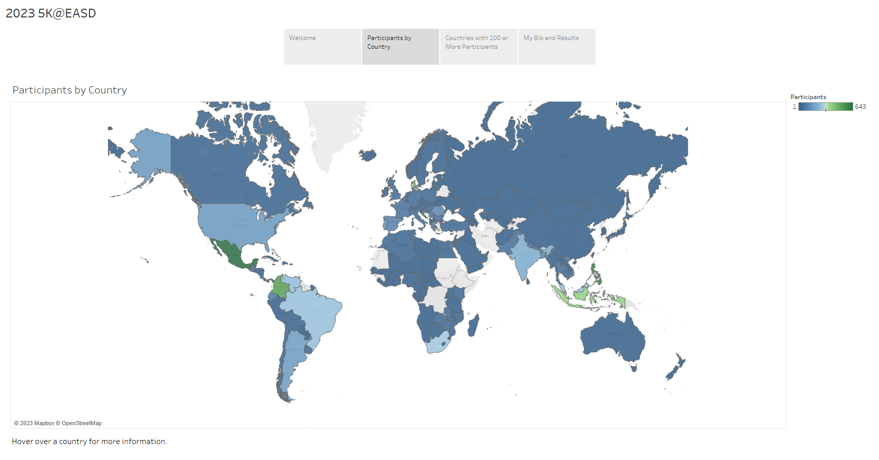
Delve into the fascinating statistics from the 2023 5K@EASD virtual run. This analysis serves as a testament to the power of Tableau, a tool that allows us to visualize and understand data in a matter of minutes.
You can explore the full analysis in our 5K@EASD Story Points on Tableau Public.
Story Points Breakdown
We hope this analysis provides you with a clear understanding of the 2023 5K@EASD virtual run's reach and impact. We also hope it demonstrates the potential of Tableau as a powerful tool for data visualization and analysis.
As a data analyst living with type 2 diabetes, I have a unique perspective on the intersection of data analytics and health outcomes. The power of data analytics is transforming the way we manage chronic diseases such as type 2 diabetes, leading to improved health outcomes and quality of life for patients.
Data analytics can significantly improve health outcomes for people with Type 2 Diabetes (T2D) in several ways:
Data analytics is a powerful tool in improving health outcomes for people with T2D by enabling predictive modeling, intervention evaluation, behavior pattern detection, real-time health data analysis, and data-driven modeling.
Please visit https://jcst2d.com/ to learn more about type 2 diabetes.
Frequently Asked Questions
How do patients contribute their data for analysis, and what are the privacy implications?
Patients contribute data through various means including electronic health records, wearable devices, and mobile apps. Privacy is protected by laws like HIPAA in the U.S., ensuring data is anonymized and securely handled to prevent unauthorized access.
What are some specific examples of interventions that have been evaluated using data analytics, and what were their outcomes?
Specific examples might include programs aimed at lifestyle modification, medication adherence, or remote monitoring systems. Outcomes often measure improvements in glycemic control, reduced hospital admissions, or enhanced patient engagement.
How accessible are these data analytics tools and models to healthcare providers, especially those in resource-limited settings?
These tools' accessibility varies widely. In resource-rich settings, hospitals and clinics might integrate sophisticated analytics into their systems. However, in resource-limited settings, the high cost and technical requirements can be significant barriers, though simpler, low-cost solutions are being developed to bridge this gap.
TELUS Corp., a prominent player in the telecommunications industry, has leveraged Google's Contact Center AI (CCAI) to revolutionize its approach to data analysis and customer service. Google Contact Center AI is a platform designed to enhance customer interactions by providing human-like, AI-powered experiences. It enables virtual agents to conduct natural and accurate multi-turn conversations, supports human agents with real-time information and guidance, and turns conversations into actionable insights through advanced analytics and reporting.
By adopting Google CCAI, TELUS has been able to improve the efficiency and effectiveness of its contact centers. The AI analyzes up to 60,000 contact center calls daily, helping TELUS to accurately identify customer intentions and sentiments. This deep understanding of customer interactions allows TELUS to discover opportunities for improvement and deliver a more personalized service experience.
The strategic alliance formed between TELUS and Google Cloud in 2021 has been pivotal in TELUS's digital transformation journey. Through this partnership, TELUS has committed to utilizing Google Cloud's technologies, including CCAI, to reinvent customer experiences and achieve significant cost savings. The collaboration also focuses on co-innovating new industry solutions and strategies, starting with communications technology, healthcare, agriculture, security, and automation.
TELUS' innovative use of generative AI models, as part of its broader AI strategy, has been a game-changer in customer service. These AI models can generate new content, which can be used to train call agents and improve customer interactions. The generative AI models by Google, demonstrated by TELUS, are a testament to the transformative power of AI in driving out inefficiencies and reducing redundant workflows.
TELUS' transformation of data analysis with Google Contact Center AI exemplifies how AI can automate contact centers, empower teams with insights, and ultimately delight customers with improved service while lowering operational costs.
Contact Center AI (CCAI) Platform
https://cloud.google.com/solutions/contact-center-ai-platform
Frequently Asked Questions
What specific challenges did TELUS face with their previous data analysis processes before adopting Google's Contact Center AI?
Before adopting Google's Contact Center AI, TELUS faced several specific challenges with their previous data analysis processes:
Siloed Data Assets: TELUS had data assets that were siloed, which hindered the efficient use and analysis of data across the organization. This fragmentation made it difficult to gain a comprehensive understanding of data and leverage it for strategic decision-making.
Inefficient Data Engineering Tasks: The process of data engineering, which includes data collection, storage, and preprocessing, was slow and cumbersome. This inefficiency delayed the time to insights and made it challenging to respond quickly to business needs.
Limited Data Democratization: Before the modernization, data was not easily accessible across different business units within TELUS. This limited the ability to share insights and collaborate on data-driven projects, especially given TELUS's diverse operations spanning telecommunications, healthcare, security, and agriculture.
Complex Data Governance: Ensuring data governance, including the management of data access, quality, and compliance, was complex due to the dispersed nature of data assets. This complexity made it challenging to maintain a single source of truth and ensure data reliability.
Security and Privacy Concerns: As TELUS's data science practice expanded, maintaining the security and privacy of data became increasingly critical. The company needed to ensure that data used for analysis could not be attributed to any single subscriber, while also meeting data sovereignty requirements.
Slow Innovation and Experimentation: The previous infrastructure and processes at TELUS did not support rapid experimentation and innovation. The need for a faster framework to test ideas and iterate them was evident to minimize the impact of failures and quickly identify successful projects.
How did the implementation of Google's Contact Center AI impact TELUS's operational costs and customer satisfaction metrics specifically?
Operational Costs Reduction
Automated Systems Success Increase: The use of automated systems to resolve customer issues increased by 50%, indicating a significant improvement in efficiency and a potential reduction in the need for human intervention, which can be costly.
Data Processing Acceleration: Data processing times were accelerated by 20 times, suggesting that TELUS could handle customer data and inquiries much faster, leading to potential cost savings in operations and customer service.
Customer Service Costs: The implementation of Google's CCAI directly contributed to reducing customer service costs. This reduction is likely due to the increased efficiency and automation capabilities provided by the AI, which reduces the workload on human agents and the resources needed to manage customer inquiries.
Customer Satisfaction Metrics Improvement
Customer Experience Improvement: The use of Google's CCAI not only reduced costs but also improved customer experiences. This improvement could be attributed to faster response times, more accurate and helpful automated responses, and a more personalized service through better data management and analysis.
Increased App Users: The number of app users grew from 400,000 to 1.2 million, indicating a broader acceptance and satisfaction with the digital services provided by TELUS. This growth suggests that customers found the app more useful and engaging, which can be a direct result of the improved functionalities enabled by the AI technologies.
Efficiency in Contact Center Operations: The integration of Google Cloud Contact Center AI and Automation Anywhere’s Automation 360 RPA platform led to a 66% improvement in the efficiency of contact center operations. This efficiency not only reduces operational costs but also enhances customer satisfaction by ensuring quicker and more accurate responses to inquiries.
Are there any case studies or examples of how TELUS's use of generative AI models has directly improved customer service interactions?
Automated Customer Service Solutions
TELUS International has developed automated customer service solutions that utilize GenAI to provide immediate, 24/7 support to customers. These solutions are designed to handle a wide range of customer inquiries, from simple questions to more complex issues, without the need for human intervention. This not only speeds up response times but also allows human customer service representatives to focus on more complex and nuanced customer needs.
Virtual Agent and Conversational App Building
The company has also invested in virtual agent and conversational app building, leveraging GenAI to create more natural and engaging interactions with customers. These virtual agents are capable of understanding and responding to customer inquiries in a way that mimics human conversation, making the customer service experience more seamless and enjoyable.
Automated Summarization for Interaction Overviews
Another innovative application of GenAI by TELUS International is automated summarization for interaction overviews, knowledge bases, and self-service FAQs. This technology can quickly summarize the content of customer interactions, making it easier for customer service agents to understand the context of a customer's issue and provide more accurate and personalized support.
Language Translation
TELUS International's GenAI solutions also include language translation features with automated detection and omnichannel support. This capability ensures that customers can receive support in their preferred language, breaking down language barriers and making customer service more accessible to a wider audience.
Personalization at Scale
A key benefit of GenAI in customer service is its ability to facilitate personalization at scale. TELUS International leverages GenAI to generate personalized content and recommendations for customers, enhancing the overall customer experience by making interactions more relevant and tailored to individual needs.
Continuous Improvement
TELUS International's approach to GenAI in customer service is not static; the company continuously seeks to enhance its GenAI solutions with new capabilities and improvements. This ongoing commitment to innovation ensures that TELUS International remains at the forefront of leveraging AI to improve customer service interactions.
Page 7 of 9


![]()

