
A Tableau Case Study Using Continuous Glucose Monitor Data

Thoughtful visualization design turns CGM data into clearer insight by showing when patterns occur, how stable they are, and how design choices influence the way people interpret the data.
Summary
Thoughtful data design makes complex patterns easier to understand. Hourly Time in Range and Variation by Hour views can reveal glucose patterns that daily summaries often hide, while choices around aggregation, paired metrics, color, and audience context shape whether data feels like judgment or useful information.
Key Points
- Daily summaries can hide important timing patterns.
A single Time in Range percentage may be useful, but it doesn’t show when glucose patterns occur. - Hourly aggregation provides better context.
Grouping CGM readings by hour helps reveal recurring patterns across 7, 14, 30, or 90 days. - Time in Range and Variation work better together.
Time in Range shows how often readings stay within range, while Variation by Hour shows how stable those readings are. - Visualization design choices affect interpretation.
Color scales, labels, aggregation, and chart structure influence whether viewers see pattern, noise, pressure, or context. - Good analytics requires audience awareness.
A chart should not only be accurate. It should fit the audience, the purpose, and the way the information may land.
The Human Side of Data Design
Data visualizations do more than present numbers.
They influence what people notice, what they understand, and how they respond. A chart can clarify a pattern, but it can also unintentionally create confusion, pressure, or the wrong conclusion. That matters in any data project. It matters even more when the data is personal.
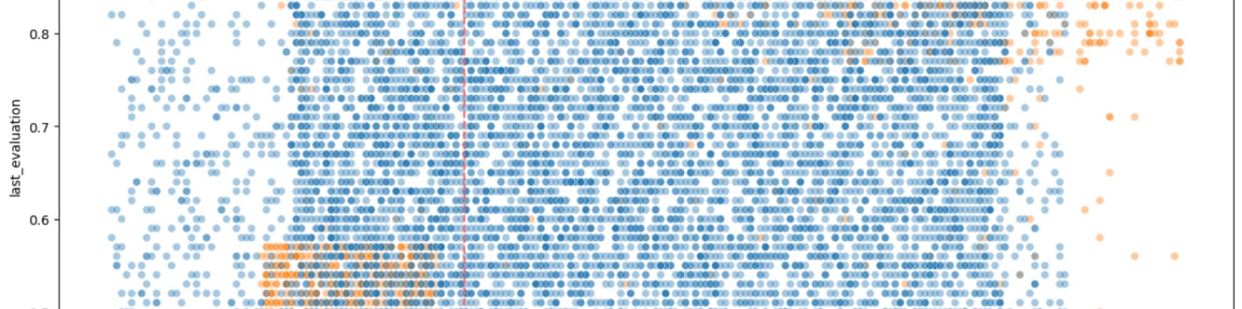
Continuous glucose monitor, or CGM, data is a good example. CGM systems produce readings throughout the day, creating a detailed view of glucose patterns. That detail can be useful, but it can also be overwhelming. A single daily summary may look simple, but it can hide when changes occur. It can also make the data feel like a score instead of a pattern.
That was the design challenge behind my Time in Range by Hour and Variation by Hour Tableau visualizations. The goal was not just to show glucose data. The goal was to show it in a way that helped people understand what was happening without adding unnecessary judgment.
The Problem with a Single Daily Number
Daily Time in Range is useful. It tells you what percentage of the day glucose readings stayed within a selected range. For many people with diabetes, that range is commonly shown as 70 to 180 mg/dL. A tighter range, such as 70 to 140 mg/dL, may also be useful for some types of analysis.
The problem is that a daily percentage does not show timing.
A day with lower Time in Range might reflect a broad pattern across many hours. It might also reflect one specific period, such as after a meal. Without more context, the daily number can suggest a larger problem than the data actually shows.
That's where visualization design becomes important.
The question wasn't, “Can I calculate the daily percentage?” The better question was, “What view helps the audience understand where the pattern actually occurs?”
Moving from Daily Summaries to Hourly Patterns
The hourly view changes the analysis.
Instead of summarizing the entire day as one number, Time in Range by Hour groups CGM readings by hour of the day. Each hour shows the percentage of readings that fall within the selected range.
This makes the chart more informative because it shows when glucose levels are most often in range and when they tend to rise or fall.
This matters because patterns often appear across multiple days. One isolated day may not say much. Seven, fourteen, thirty, or ninety days can show whether something happens consistently.
That's a practical analytics principle:
The right level of aggregation depends on the question.
Daily aggregation answers one question. Hourly aggregation answers another.
Pairing Time in Range with Variation
Time in Range by Hour answers an important question:
How often are glucose readings in range during each hour of the day?
But that's not the whole story.
A second visualization, Variation by Hour, shows how much glucose readings fluctuate during those same hourly periods. It uses coefficient of variation (CV) to measure glucose stability. The two views are complementary: one shows control, while the other shows stability.
That pairing matters.
An hour may show strong Time in Range, but still have high variation. Another hour may show both strong Time in Range and low variation. Seeing both measures together gives a fuller picture than either measure can provide on its own.
This is another useful analytics lesson:
One metric may answer the main question, but a second metric may explain the context.
The Tableau Design Structure
Both visualizations use the same hourly grouping method. That consistency allows the viewer to compare Time in Range and Variation across the same time periods.
The Tableau calculated fields use hourly bins to group readings by time of day. The first field rounds each reading down to the nearest hour. The second extracts and formats the time value for labels such as “9 AM” or “10 PM.”
Time Bins 60
DATETIME(DATETRUNC('hour', [Date Time]))Time NB 60
FLOAT([Time Bins 60]) - INT([Time Bins 60])That may sound like a small technical detail, but it's central to the design.
If two charts use different time logic, the comparison becomes harder to trust. If they share the same structure, the viewer can move between them more easily.
Good visualization design often depends on this kind of behind-the-scenes consistency. The chart should feel simple to the audience, even when the data preparation and calculated fields require careful thought.
Color Is Not Neutral
One of the most important design choices was the color scale.
The visualizations use a green-to-blue scale instead of a green-to-orange or green-to-red scale. That choice was intentional. Green-red color schemes can imply success and failure. In glucose data, that can make a chart feel like judgment.
The goal was different. I wanted the colors to support interpretation without suggesting that the person viewing the chart had done something “good” or “bad.”
In this design:
- Greener tones indicate more Time in Range or lower variation.
- Bluer tones indicate less Time in Range or higher variation.
The chart still communicates differences clearly, but it avoids adding unnecessary emotional weight.
That's an important point for any data analyst. Color is not decoration. Color carries meaning. Sometimes it carries meaning we didn't intend.
Designing for the Audience
A visualization that works for one audience may not work for another.
A data analyst may look at a chart and focus on structure, bins, filters, and calculations. A clinician may focus on patterns that support care decisions. A person living with diabetes may see something more personal.
That doesn't mean the visualization should avoid difficult information. It means the design should present the information clearly and responsibly.
For CGM data, that means avoiding designs that make normal variation feel like failure. It also means showing enough context to help the viewer understand whether a reading reflects an isolated event or a recurring pattern.
The audience matters. The purpose matters. How the chart lands matters. That's why visualization design requires both technical accuracy and empathy for the person using the result.
The Broader Analytics Lesson
This project started with glucose data, but the lesson applies more broadly.
Visualizations are not just output. They are part of the analytical process. They help define how people interpret the data and what questions they ask next.
A good visualization should do more than look clean. It should help the audience understand the right thing with the right amount of context.
That requires technical accuracy, but it also requires judgment.
The analyst has to decide:
- What level of detail helps?
- What aggregation hides too much?
- What labels reduce confusion?
- What colors support interpretation?
- What might the audience assume when they see the chart?
- What might the chart unintentionally imply?
Those choices affect the usefulness of the final product.
Why This Matters
Data visualization is often treated as the final step in analysis. Build the dataset, run the calculations, create the chart, publish the result.
But visualization isn't just a presentation layer. It's an interpretation layer.
The design choices behind a chart influence whether people see noise or pattern, pressure or context, confusion or clarity.
With CGM data, moving from daily summaries to hourly views helps shift the focus from judgment to understanding. The same principle applies across many types of data. When we design visualizations thoughtfully, we do more than make data easier to see. We make it easier to use.
That's where good analytics work becomes more than reporting.
It becomes communication.
Explore the Related Work
The companion article on JCS/T2D looks at how hourly glucose visualizations can reduce anxiety and reveal real patterns:
A Clearer, More Human View of Glucose Patterns
The interactive dashboards on Tableau Public:
Example Time in Range and Coefficient of Variation (CV) Visualizations


