
TELUS Corp., a prominent player in the telecommunications industry, has leveraged Google's Contact Center AI (CCAI) to revolutionize its approach to data analysis and customer service. Google Contact Center AI is a platform designed to enhance customer interactions by providing human-like, AI-powered experiences. It enables virtual agents to conduct natural and accurate multi-turn conversations, supports human agents with real-time information and guidance, and turns conversations into actionable insights through advanced analytics and reporting.
By adopting Google CCAI, TELUS has been able to improve the efficiency and effectiveness of its contact centers. The AI analyzes up to 60,000 contact center calls daily, helping TELUS to accurately identify customer intentions and sentiments. This deep understanding of customer interactions allows TELUS to discover opportunities for improvement and deliver a more personalized service experience.
The strategic alliance formed between TELUS and Google Cloud in 2021 has been pivotal in TELUS's digital transformation journey. Through this partnership, TELUS has committed to utilizing Google Cloud's technologies, including CCAI, to reinvent customer experiences and achieve significant cost savings. The collaboration also focuses on co-innovating new industry solutions and strategies, starting with communications technology, healthcare, agriculture, security, and automation.
TELUS' innovative use of generative AI models, as part of its broader AI strategy, has been a game-changer in customer service. These AI models can generate new content, which can be used to train call agents and improve customer interactions. The generative AI models by Google, demonstrated by TELUS, are a testament to the transformative power of AI in driving out inefficiencies and reducing redundant workflows.
TELUS' transformation of data analysis with Google Contact Center AI exemplifies how AI can automate contact centers, empower teams with insights, and ultimately delight customers with improved service while lowering operational costs.
Contact Center AI (CCAI) Platform
https://cloud.google.com/solutions/contact-center-ai-platform
Frequently Asked Questions
What specific challenges did TELUS face with their previous data analysis processes before adopting Google's Contact Center AI?
Before adopting Google's Contact Center AI, TELUS faced several specific challenges with their previous data analysis processes:
Siloed Data Assets: TELUS had data assets that were siloed, which hindered the efficient use and analysis of data across the organization. This fragmentation made it difficult to gain a comprehensive understanding of data and leverage it for strategic decision-making.
Inefficient Data Engineering Tasks: The process of data engineering, which includes data collection, storage, and preprocessing, was slow and cumbersome. This inefficiency delayed the time to insights and made it challenging to respond quickly to business needs.
Limited Data Democratization: Before the modernization, data was not easily accessible across different business units within TELUS. This limited the ability to share insights and collaborate on data-driven projects, especially given TELUS's diverse operations spanning telecommunications, healthcare, security, and agriculture.
Complex Data Governance: Ensuring data governance, including the management of data access, quality, and compliance, was complex due to the dispersed nature of data assets. This complexity made it challenging to maintain a single source of truth and ensure data reliability.
Security and Privacy Concerns: As TELUS's data science practice expanded, maintaining the security and privacy of data became increasingly critical. The company needed to ensure that data used for analysis could not be attributed to any single subscriber, while also meeting data sovereignty requirements.
Slow Innovation and Experimentation: The previous infrastructure and processes at TELUS did not support rapid experimentation and innovation. The need for a faster framework to test ideas and iterate them was evident to minimize the impact of failures and quickly identify successful projects.
How did the implementation of Google's Contact Center AI impact TELUS's operational costs and customer satisfaction metrics specifically?
Operational Costs Reduction
Automated Systems Success Increase: The use of automated systems to resolve customer issues increased by 50%, indicating a significant improvement in efficiency and a potential reduction in the need for human intervention, which can be costly.
Data Processing Acceleration: Data processing times were accelerated by 20 times, suggesting that TELUS could handle customer data and inquiries much faster, leading to potential cost savings in operations and customer service.
Customer Service Costs: The implementation of Google's CCAI directly contributed to reducing customer service costs. This reduction is likely due to the increased efficiency and automation capabilities provided by the AI, which reduces the workload on human agents and the resources needed to manage customer inquiries.
Customer Satisfaction Metrics Improvement
Customer Experience Improvement: The use of Google's CCAI not only reduced costs but also improved customer experiences. This improvement could be attributed to faster response times, more accurate and helpful automated responses, and a more personalized service through better data management and analysis.
Increased App Users: The number of app users grew from 400,000 to 1.2 million, indicating a broader acceptance and satisfaction with the digital services provided by TELUS. This growth suggests that customers found the app more useful and engaging, which can be a direct result of the improved functionalities enabled by the AI technologies.
Efficiency in Contact Center Operations: The integration of Google Cloud Contact Center AI and Automation Anywhere’s Automation 360 RPA platform led to a 66% improvement in the efficiency of contact center operations. This efficiency not only reduces operational costs but also enhances customer satisfaction by ensuring quicker and more accurate responses to inquiries.
Are there any case studies or examples of how TELUS's use of generative AI models has directly improved customer service interactions?
Automated Customer Service Solutions
TELUS International has developed automated customer service solutions that utilize GenAI to provide immediate, 24/7 support to customers. These solutions are designed to handle a wide range of customer inquiries, from simple questions to more complex issues, without the need for human intervention. This not only speeds up response times but also allows human customer service representatives to focus on more complex and nuanced customer needs.
Virtual Agent and Conversational App Building
The company has also invested in virtual agent and conversational app building, leveraging GenAI to create more natural and engaging interactions with customers. These virtual agents are capable of understanding and responding to customer inquiries in a way that mimics human conversation, making the customer service experience more seamless and enjoyable.
Automated Summarization for Interaction Overviews
Another innovative application of GenAI by TELUS International is automated summarization for interaction overviews, knowledge bases, and self-service FAQs. This technology can quickly summarize the content of customer interactions, making it easier for customer service agents to understand the context of a customer's issue and provide more accurate and personalized support.
Language Translation
TELUS International's GenAI solutions also include language translation features with automated detection and omnichannel support. This capability ensures that customers can receive support in their preferred language, breaking down language barriers and making customer service more accessible to a wider audience.
Personalization at Scale
A key benefit of GenAI in customer service is its ability to facilitate personalization at scale. TELUS International leverages GenAI to generate personalized content and recommendations for customers, enhancing the overall customer experience by making interactions more relevant and tailored to individual needs.
Continuous Improvement
TELUS International's approach to GenAI in customer service is not static; the company continuously seeks to enhance its GenAI solutions with new capabilities and improvements. This ongoing commitment to innovation ensures that TELUS International remains at the forefront of leveraging AI to improve customer service interactions.
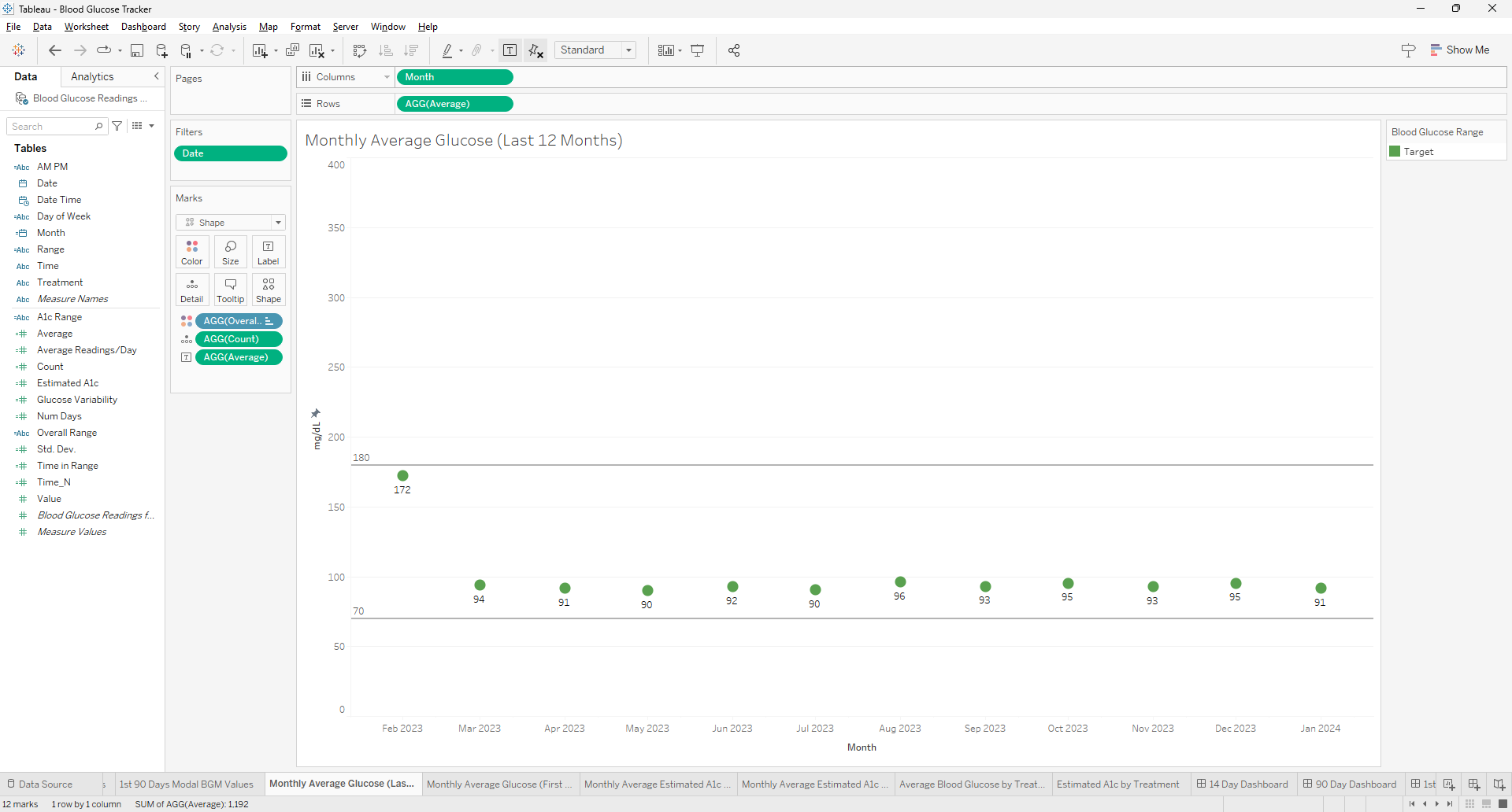
Creating a visualization for the most recent 12 months in Tableau can be a common requirement for time series analysis. To achieve this, you can use the `DATETRUNC` function to truncate your date data to the first day of each month, ensuring that your months will be in the correct order when aggregated. Here's how to use the `DATE(DATETRUNC('month',[Date]))` function effectively in Tableau for this purpose.
Understanding the DATETRUNC Function
The `DATETRUNC` function in Tableau truncates a given date to the specified date part, such as the year, quarter, or month. When you use `DATETRUNC('month', [Date])`, it will return the first day of the month for each date in your dataset. This is useful for creating consistent monthly data points for visualization purposes.
Steps
Benefits of Using DATETRUNC
Using the `DATE(DATETRUNC('month',[Date]))` function in Tableau is a powerful way to prepare your data for visualizations that require monthly aggregation. It ensures that your months are in order and that your visualization reflects the most recent 12-month period. This approach is part of Tableau's robust time series analysis capabilities, which allow for insightful trend spotting and variance analysis over time.
Frequently Asked Questions
Can this method be applied to other time units (like weeks or days) and if so, how would the approach change?
The DATETRUNC function can indeed be applied to other time units such as weeks or days. The approach remains similar, but the unit of truncation in the function needs to change (e.g., 'week' or 'day') to reflect the desired aggregation level.
How can you use the calculated field created with DATETRUNC in Tableau to compare year-over-year data?
To compare year-over-year data using DATETRUNC, you can create separate calculated fields for the current and previous years by manipulating the date part of your DATETRUNC calculation. Then, use these fields in your visualization to compare performance across different years.
What are the best practices for ensuring that the date formatting in the calculated field matches the rest of the dashboard elements in Tableau?
Best practices for consistent date formatting include setting the default date format in the data source, using calculated fields to standardize date formats, and applying consistent formatting settings across dashboard elements directly within Tableau's format options.
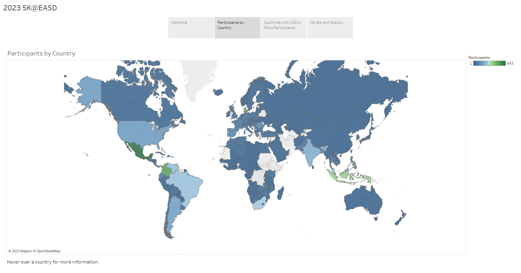
Delve into the fascinating statistics from the 2023 5K@EASD virtual run. This analysis serves as a testament to the power of Tableau, a tool that allows us to visualize and understand data in a matter of minutes.
You can explore the full analysis in our 5K@EASD Story Points on Tableau Public.
Story Points Breakdown
We hope this analysis provides you with a clear understanding of the 2023 5K@EASD virtual run's reach and impact. We also hope it demonstrates the potential of Tableau as a powerful tool for data visualization and analysis.
Page 4 of 4


![]()

